Once we correct (even crudely) for demography in the 2009 PISA scores, (PISA is the Program for International Student Assessment) American students outperform Western Europe by significant margins and tie with Asian students. Jump to the graphs if you don't want to read my boring set-up and methodology.
The main theme in my blog is that we shouldn’t confuse policy with culture, and with demographic factors.
For instance, education scholars have known for decades that the home environment of the kids and the education levels of the parents are very important for student outcomes. We also know that immigrant kids have a more difficult time at school, in part because they don’t know the language.
Take me as an example. The school me and my brother attended was in a basement in Tehran, had no modern resources, and largely focused on religious indoctrination. But we had a good home background. Our father attended a college in the west a few years (our mother didn’t, despite stratospheric scores test scores, because at the time you didn’t send a good Kurdish girl to another city to study). So we did well in school. Conversely, the first few years in Sweden I had bad grades, in part because I didn’t master the language.
The point I am trying to make is that the school in Sweden was objectively superior to the school in Iran. But I scored lower in Sweden, because of factors outside the control of the education system. If you want to compare the effect of the school, you have to isolate those external factors and make an apples-to-apples comparison.
However, this is not at all how the media is presenting the recent PISA scores. For example there is a lot of attention of the score of the kids in Shanghai, the according to the NYT is supposed to “stun” us or something.
It's dumb to compare one of the most elite cities in a country with entire nations, and to draw policy-inference from such a comparison. Shanghai has 3 times the average income of China! It is also naive to trust the Chinese government when they tell us the data is representative of the entire nation. Either you compare Shanghai to New York City, or you compare the entire country of China, including the rural part, with other large nations. Most of the news and policy conclusions we read about PISA-scores in the New York Times is thus pure nonsense. 1. Correcting for the demography:
In almost all European countries, immigrants from third world countries score lower than native born kids.
Why? No knows exactly why. Language, culture, home environment, income of parents, the education level of the parents and social problems in the neighborhood and peer groups norms are among likely explanations. But it is generally not true that the schools themselves are worse for immigrants than natives. In welfare states, immigrants often (thought not always) go to the same or similar schools and have as much or likely more resources per student.
So the fact that immigrant students in mixed schools do worse than Swedish kids used to a few decades ago in homogeneous schools does not it out of itself prove that Swedish public schools have become worse.
Of course, the biggest myth that the media reporting of PISA scores propagates is that the American public school system is horrible.
The liberal left in U.S and in Europe loves this myth, because they get to demand more government spending, and at the same time get to gloat about how much smarter Europeans are than Americans. The right also kind of likes the myth, because they get to blame social problems on the government, and scare the public about Chinese competitiveness.
We all know that Asian students beat Americans students, which "proves" that they must have a better education system. This inference is considered common sense among public intellectuals. Well, expect for the fact that Asian kids in the American school system actually score slightly better than Asian kids in North-East-Asia!
So maybe it’s not that there is something magical about Asian schools, and has more to do with the extraordinary focus on education in Asian culture, with their self-discipline and with their favorable home environment.
There are 3 parts to the PISA test, Reading, Math, and Science. I will just make it simple and use the average score of the 3 tests. This is not strictly correct, but in practice it doesn’t influence the results, while making it much easier for the reader. (the reason it doesn't influence the results is that countries that are good at one part tend to be good at other parts of the test.)
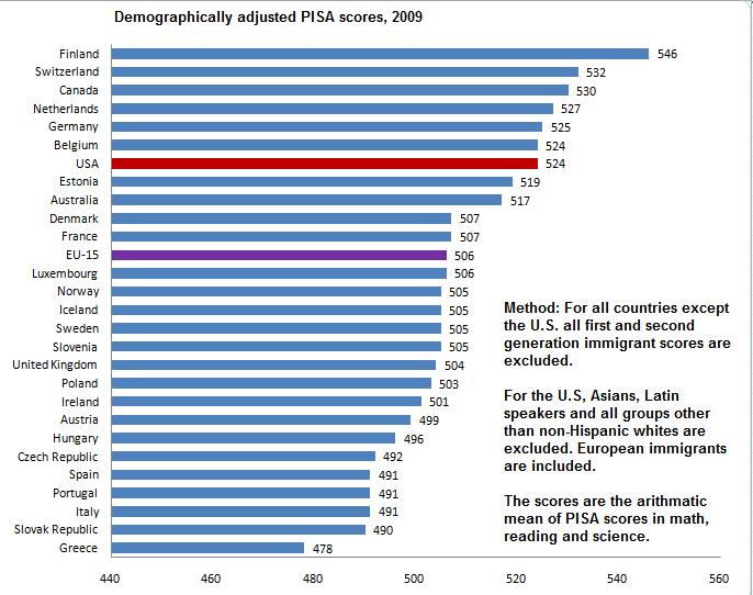
The simplest thing to do in order to get an apples-to-apples comparison is to at least correct for demography and cultural background. For instance, Finland scores the best of any European country. However first and second generation immigrant students in Finland do not outperform native Swedish, and score 50 points below native Finns (more on this later).
On PISA, 50 points is a lot. To give you a comparison, 50 points is larger than the difference between Sweden and Turkey. A crude rule of thumb here is that 50 points is 0.5 standard deviations.
The problem is that different countries have different share of immigrants. Sweden in 2009 PISA data had 17%, and Finland 4%. It’s just not fair to the Swedish public school system to demand that they must produce the same outcome, when Sweden has many more disadvantaged students. Similarly schools with African-American students who are plagued by racism, discrimination, crime, broken homes, poverty and other social problems are not necessarily worse just because their students don’t achieve the same results as affluent suburbs of Chicago. In fact, the most reliable data I have seen suggests that American minority schools on average have slightly more money than white schools. It’s just that the social problems they face are too much to overcome for the schools. It is illogical to blame the public school system for things out of its hands.
So let’s start by removing those with foreign background immigrants from the sample when comparing European countries with each other. I define immigrants here as those with a parent born outside the country, so it includes second generation immigrants. This is fairly easy for Europe.
In the case of America, 99% of the population originates from other countries, be they England, Italy, Sweden, India, Africa, Hong-Kong or Mexico. If we want to isolate the effect of the United States public school system, we should compare the immigrant groups with their home country. For those majority of Americans whose ancestors originate from Europe, we obviously want to compare them with Europe. For some groups, such as Indians, this is inappropriate. The reason is that mainly the most gifted Indians get to migrate to America to work or study.
However, as I have argued previously, there is strong reason to believe that this problem of so called biased selection does not apply to historic European migration to the United States at the aggregate level. The people who left Europe were not better educated than those who stayed. Immigrants were perhaps more motivated, but often poorer than average.
So similar to my comparison of GDP levels, let us compare Americans with European ancestry (about 65% of the U.S population, and not some sort of elite) with Europeans in Europe. We remove Asians, Mexicans, African-Americans and other countries that are best compared to their home nations. In Europe, we remove immigrants. The results are astonishing at least to me. Rather than being at the bottom of the class, United States students are 7th best out of 28, and far better than the average of Western European nations where they largely originate from.
The mean score of Americans with European ancestry is 524, compared to 506 in Europe, when first and second generation immigrants are excluded. So much for the bigoted notions that Americans are dumb and Europeans are smart. This is also opposed to everything I have been taught about the American public school system.
For Asian-American students (remember this includes Vietnam, Thailand and other less developed countries outside Northeast Asia), the mean PISA score is 534, same as 533 for the average of Japan, South Korea, Singapore and Hong Kong. Here we have two biases going in opposite directions: Asians in the U.S are selected. On the other hand we are comparing the richest and best scoring Asian countries with all Americans with origin in South and East Asia.
2. Policy-Implications
Libertarians in the United States have often claimed that the public school system (which has more than 90% of the students) is a disaster. They blame this on government control and on teachers unions. However, it is completely unfair to demand that a public school in southern California where most of the students are recent immigrants from Mexico whose parents have no experience in higher education (only 4% of all Mexican immigrates have a college degree, compared to over 50% of Indian immigrants) should perform as well as a private school in Silicon Valley.
The libertarians have no answer why European and Asian countries that also have public school systems score higher than the United States (unadjusted for demography). Top scoring Finland has strong teacher unions, just as California.
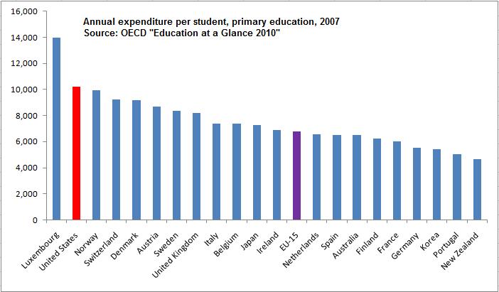
Similarly, the left claims that the American education system is horrible, because Americans don’t invest enough in education. The left has no answer when you point out that the United States spends insanely more than Europe and East Asia on education. According to the OECD, the United States spends about 50% more per pupil than the average for Western Europe, and 40% more than Japan.
Another policy implication is that Europe can learn from American public schools, which appear to be better than most European countries. I can only compare Sweden with the U.S, but I can tell you that from my experience, the American system is superior. I always thought this was just anecdotal evidence, but I am beginning to realize that American schools are indeed better.
For example, we don’t have any real equivalent to Advanced Placements classes. We have cheaper and worse textbooks. The teachers on average have far less education. I could go on.
Nor is it any longer a mystery to me why Americans spend so much more on education and (falsely appear) to get out less in output.
But of course the biggest implication is that most Europeans and all American liberals have lost the bragging right about their side being smarter than Americans. 3. Immigrant PISA scores compared to natives
This is again the mean difference of the 3 parts of PISA.
Australia is the only country with a negative gap, which means Australian immigrants actually score better than natives. Canada is similar. The Australian-Canadian skill based migration system is at work here, generating less inequality (even short term).
The other pattern appears to be that the gap is almost constant in the remaining Western European countries. This may be important to keep in mind, whenever people claim that uniquely Swedish policies are causing poor immigrant educational outcomes.
Tino Sanandaji is of Kurdish origins, and was born in Iran in 1980. In 1989 he moved together with his mother and brother to Sweden. He has a degree from the Stockholm School of Economics, his M.A in Economics from the University of Chicago and is expected to receive his PhD in Public Policy from the University of Chicago in 2011. His work has appeared in The Wall Street Journal, The New York Times, National Review, and numerous Swedish newspapers. Tino has been a resident of Hyde Park Chicago, since 2004.
The Illinois Department of Transportation has reached a cooperative agreement with Union Pacific and Amtrak that will permit the release of a $1.1 billion federal high-speed rail grant to the state of Illinois to fund passenger rail improvements between Chicago and St. Louis. The agreement was proclaimed by state and federal officials as "historic" and hailed as "one giant step closer to achieving high-speed passenger service between Chicago and St. Louis." But stripped of its rhetoric, the announcement only reveals how inadequate and cost-ineffective the Administration's "high--speed" program is turning out to be.
The billion dollar program of improvements to be completed under the Cooperative Agreement will enable "higher-speed" trains to travel between Chicago and St. Louis in 4 hours and 32 minutes, cutting present trip time by 48 minutes when the planned improvements are completed by 2014. As the Springfield Journal Register pointedly observed, that is 22 minutes longer than the trip time of 4 hours and 10 minutes promised in the original grant application. A four-hour trip time was also pledged in the White House press release announcing the project last January.
Currently Amtrak operates passenger service between Chicago and St. Louis at an average speed of 53 mph. The announcement is silent about the expected improvement in the average speed when the project is completed but our calculations suggest that the planned improvements would increase average speeds only by 9mph, to 62 mph. Of the 284-mile Chicago-St. Louis route, a total of 210 miles of track will be ready for 110 mph operation under the present grant. Upgrading the remaining 74 miles of the line, between Dwight and Chicago, would have to await further federal aid. The State of Illinois originally requested $3 billion to complete the total project.
From what we can read between the lines, Union Pacific drove a hard bargain as a condition of signing the cooperative agreement. "Our priority in working out this agreement," the company’s CEO, Jim Young said in a prepared statement, "was to protect Union Pacific’s ability to provide the exceptional freight service our customers need and expect. ... This agreement allows us to deliver on those customer commitments." The message is clear: UP’s freight operations will take precedence over passenger rail operations. The route, we are told, is expected to accommodate as many as 22 freight trains a day ultimately.
Union Pacific also seems to have won out on another contentious issue. The cooperative agreement is silent about any penalties the railroad might face if on-time performance standards for passenger service are not met – a condition that the Federal Railroad Administration had insisted upon in its initial (and later withdrawn) guidelines concerning the terms of the cooperative agreements.
The announcement, released on December 23, barely two weeks before a new Congress takes office, was meant to give a boost to a program that is barely limping along. The record speak for itself. Two major high-speed rail projects — in Wisconsin and Ohio — have been cancelled by the incoming governors because of the cost burden the operation of the new rail services would impose on the state taxpayers. The Florida Tampa-to-Orlando high-speed line is still in doubt as Gov.-elect Rick Scott ponders its cost and economics. The California high-speed rail program, with its starter line in the sparsely populated Central Valley, has been ridiculed as "the railroad to nowhere." And several HSR cooperative agreements remain stalled in contentious negotiations. It’s not surprising that the Administration would be anxious to show progress and refute the widely held impression that the program is on its last legs. This is not how it was all supposed to end.
Whether the program will, indeed, come to an untimely end will depend on the next Congress. To the incoming Republican lawmakers, eager to make good on their promise to cut federal spending, any unspent HSR funds will present a tempting target for rescission. In addition, future appropriations for the program will have to compete with other urgent transportation priorities amid pressures to trim discretionary spending and Congressman Mica's announced intent to revisit the program and refocus it in ways that, in his words, "makes sense."
It is not a scenario that offers high-speed rail advocates much cheer in the New Year.
Ken Orski is a former senior U.S. Transportation Department official and publisher of Innovation NewsBriefs, a transportation newsletter now in its 21st year of publication.
Reporters, columnists and even consultants often misunderstand urban areas and urban terms. The result can be absurd statements that compare the area in which the writer lives to somewhere else where the grass is inevitably greener, bringing to mind an expensive competitiveness report that suggested St. Louis should look to Cleveland as a model. Sometimes this is the result of just not understanding and other times it results from listening to itinerant missionaries from idealized areas who have no sense of the reality.
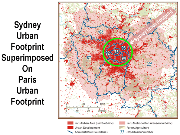
A most recent example is from the Sydney Morning Herald, one of Australia's largest and most respected newspapers.
Columnist Elizabeth Farrelly told her readers that Paris covers one-quarter the land area (urban footprint) of Sydney and has a population of 5.5 million. In fact, the urban footprint of Paris is at least five times larger and the population nearly double.
According to the Institut national de la statistique et des études économiques (INSEE), the statistics bureau of France, the urban footprint of Paris was 2,723 square kilometers in 1999 and the population in that area was 10,143,000 in 2006 (both figures are the latest data available).
In contrast, according to the Australian Bureau of Statistics (ABS), the statistics bureau of Australia, the urban footprint of Sydney was 1,788 square kilometers in 2006. However, even the 50 percent larger urban footprint of Paris may actually understate the difference, because ABS uses a lower population density threshold than INSEE for urban versus rural classification. The difference between the two urban footprints is shown in the figure below.
Ms. Farrelly also decried the continuing sprawl that she perceives in Sydney, despite the fact that no urban area in the new world, except perhaps Vancouver, has shut down home construction on its fringe to a greater degree (nor even has Paris). The effect of Sydney's development Berlin Wall is housing affordability so bad that it is second only behind Vancouver out of nearly 275 metropolitan areas in the 6 nations we cover in the Demographia International Housing Affordability Survey.
I studied with the Austrian economists at New York University. The Austrian school of economics (as contrasted to Keynesians or Chicago school economists) work with a theory about business cycles that essentially starts from the understanding that what appear to be almost mechanical, regular ups and downs in the economy are actually caused by the periodic disappointment of the expectations of entrepreneurs. The alternative is to suggest that business owners periodically and collective wake up stupid one morning and start making a lot of bad decisions. A connection to the routine horizons of fiscal policy – for example, the 5-year funding cycle for federal highways – is a more likely cause of what appear to be “cycles”.
A current example of how government spending policy can make a disaster of the economy by confounding decision making is the changes/not-changes in US tax policy. What if you are a business owner who has a fiscal year that runs from July 1 to June 30? All of your plans for the first half of 2011 would have been based on the tax cuts expiring (which is the reasonable thing to do – don't change your plans until the law is changed). If the tax cuts are extended, then the last half of your budget is completely changed. In this case, there will be more net income. Being unable to plan for this, according to economic principal-agent theory, will put a lot of cash in the hands of managers who may not spend it in the best interests of the shareholders. The failure of managers to invest wisely when government stimulates business through unexpected and excessive free cash flow is well-documented.
Now imagine you are a state whose tax policy mirrors the federal policy. Tax cuts to businesses and individuals translate into revenue cuts for states, counties and cities. Any state that opts out of mirroring whatever Washington D.C. passes risks being cut-out of certain federal funding programs in the future. Nebraska, for example, passes a biannual budget. The last one covered the fiscal-years 2009-2011, which was based on the tax cuts expiring at the end of 2010. The difference if the tax cuts are extended will be a $200 million shortfall. Nebraska is a relatively small state, so consider what this will do to the budgets of all the states, plus counties and cities in the U.S. This could be the event that brings the global financial crisis in public debt home, especially to states like California which are already in trouble.
Note: A good source for more on Austrian economic theory is the Mises Institute at Auburn University. Click this for a brief on "The Austrian Theory of the Business Cycle" from Roger Garrison – who is an expert on the subject.
Chicago Magazine has an interesting article on the sore subject of Illinois corruption. The article was written by Shane Tritsch who interviews several experts on Illinois political history. There’s no “good old days” of clean government in the Land of Lincoln. Tritsch explains a major reason for Illinois’ historical graft:
Owing to historical factors, Illinois developed a labyrinthine governmental structure that offered fertile ground in which corruption could sprout. The Illinois constitution of 1870, in effect until 1970, limited the amount of debt counties and municipalities could carry and taxes they could levy. When cities needed to fund improvements, they got around those constraints by creating new units of government with the capacity to borrow—a library district, for example, would be created to build and administer a new library. “The 1870 constitution almost forced you into multiple units of government if you were going to deliver services beyond your municipality or modernize your municipality,” says Redfield. Today the state contains almost 7,000 separate governmental fiefs—far more than any other state—ranging from counties, towns, and school and fire districts to water reclamation and mosquito abatement districts. Most have budgets to protect and authority to wield. “It’s very hard to stay on top of it all, and it creates many more opportunities for patronage,” says Cindi Canary. “It creates ways for small islands of graft and corruption to stay hidden.”
It appears that Illinois’ luck is running out. According to Forbes, Illinois is number two on the list of states Americans are fleeing behind New York:
at No. 2. Illinois is expected to lose 27,000 people this year, consistent with its average annual loss over the last five years. The losses are likely linked to the state's economy and tax structure. Job losses in manufacturing and industrial machinery are likely pushing people out of the state
The bond market has taken notice of Illinois’ debt problem. While Illinois can’t go legally bankrupt, creditors can refuse to extend credit. Illinois faces massive public pension crisis in the coming years. Unfunded liabilities will make Illinois a less desirable place to invest.
The Illinois economic situation was born in Illinois’ history of corruption. Shane Tritsch’s article is a decent history on Barack Obama’s home state. The Chicago segment of Illinois corruption is certainly unique. Below is an excellent segment from a National Geographic TV special on how Chicago was taken over by the Mob.
Portland is known primarily as a cool city, where people spend their 20s happily working in the service sector, drinking craft beer, eating organic food, and exploring a variety of unconventional lifestyle options. In short, Portland is weird. That’s not just an observation: it’s the city’s marketing strategy. Keep Portland Weird is a pretty common bumper sticker in the city (believe it or not, there are cars in Portland). Yet despite the non-conformist attitude of Portlanders, the municipal government seems bent on destroying everything fun about the city.
The first attack, which I documented in Reason Magazine, is on craft beer, the city’s primary cultural export. The city attempted to increase the tax on beer producers several fold, though the motion was soundly defeated. It was the only time I’ve ever seen hippies handing out anti-tax fliers in bars on Friday nights. This was followed up by an EPA mandated tampering of the water supply, which may or may not reduce the quality of the world beer capital’s unparalleled beer.
The second attack is on street vendors. Portland has some of the most liberal rules regarding street vendors. You can find anything from Mexican to Thai food in the nearly 600 Portland street carts. This is one of the things that make the city charming. Street vendors add to the street life of the city. Yet this summer, a story about a little girl having her unlicensed lemonade stand shut down drew international attention. Now City Commissioner Randy Leonard is openly discussing a city wide crackdown on food vendors. The complaint? Many of them are guilty of attaching unlicensed appendages such as awnings and decks.
Where are the complaints originating from? You guessed it: local restaurants. They claim that street vendors are providing unfair competition, since they don’t have to provide restrooms, be wheelchair accessible, and so forth. This has so alarmed the Commissioner that he’s instructed building inspectors to assign top priority to inspecting street vendors. Ironically, this debate completely ignores the most legitimate question: are street vendors actually hurting anyone? Is their safety record worse than local restaurants? Are they blocking off public sidewalks? The answer to the first question isn’t clear, since the inspection reports aren’t reported in the same way they are for restaurants. Having said that, the health inspectors would shut them down if there were egregious violations. The second question is easier. They aren’t unduly encroaching on sidewalks. If anything, they’re providing sidewalk dwellers shelter from the rain with their unlicensed awnings.
Quirky things like world class craft beer and street vendors are what make Portland interesting. If the city is going to market itself as a destination for the creative class, it is going to have to stop cracking down on the very things that attract these people in the first place. After all, they sure aren’t moving to Portland because of the local economy.
When looking for a place to settle down, one might consider cities with active cultural scenes or intellectual communities. However, young people today are looking beyond those factors and moving to where the jobs are. Portland, for example, has a thriving social scene and is one of the nation’s leaders in attracting college graduates, but it ranks 40 as the best place for young adults. A high cost of living, stagnant job growth, and a 9.6 percent jobless rate among 18 to 34 year-olds have tarnished Portland’s reputation as the dream city for life after graduation.
You can see the economic shift in this country by looking at the best cities for young people. The Southwest is now the haven for those in their 20s and 30s looking to establish their lives and careers. Austin, which ranks number one on the list, has the highest annual employment-growth rate in America at 2.8 percent. This has increased the concentration of 18 to 34 year-olds in its metro area to 28 percent, the most of all cities in the study and well above the average of 23.1 percent. Washington, D.C., Raleigh, Boston, Houston, Oklahoma City, Dallas-Fort Worth and Tulsa round out the top eight.
However, economics do not dictate everything. North Dakota, which has one of the lowest unemployment rates in the country, is still not a major draw for those right out of college. The cities that have attracted young people in droves not only offer employment and lower costs of living, but also provide some sort of cultural scene. However, if the recession continues to limit job growth on the coasts, North Dakota may build its metro areas to cater to younger crowds, and thus provide them with more than just a steady, good-paying job. Fargo has seen positive net migration every year since 2003, and the state of North Dakota was positive for the first time this decade in 2009. The middle of the country is slowly becoming hot place to be.
It’s hard to believe that it’s been nearly two years since we first wrote about the game of “hide the ball” that Junkmeister Ben Bernanke is playing. Finally, Congress is getting some admissions out of the Federal Reserve about the gusher of cash that was opened up when the insides fell out of Wall Street’s Ponzi scheme. Remember, you read it here first! Trillions of dollars were funneled to private, non-regulated companies. According to the New York Times article, the release of documents on 21,000 transactions came about as a result of a provision inserted by Senator Bernard Sanders (I-VT) into the Restoring American Financial Stability Act of 2010. I covered the hearing in March 2009 when Bernanke told Senator Sanders he would not reveal who got the money – but I wrote three months earlier about the deal brokered between the Treasury and the Federal Reserve to circumvent a Congressional prohibition on lending to non-regulated companies. Sanders called it a Jaw Dropper by the time he saw the actual documents.
Lest you think that all is hunky-dory because the money is being paid back, don’t forget the old adage: “It takes money to make money.” Everyone that borrowed had the opportunity to make money on the money they got at (virtually) no cost. In the interim, small businesses, homeowners, student borrowers, etc. are paying enormously high interest rates for the little credit they can get. The profits go to Brother Banker.
The Federal Reserve released papers on $12 trillion, about half of the $23 trillion distribution estimated by Special Inspector General Neil Barofsky. Despite admitting to pumping an amount equal to about the entire annual national output into the economy in the form of cash – belying the real decline in the output of goods and services – Ben Bernanke told 60 Minutes recently that he was “100% certain” that inflation is not going to be a problem. Makes you wonder what else they’re hiding.
Inform Yourself:
Click here for the Federal Reserve Press release.
Click here for Regulatory Reform Transaction Data from the Federal Reserve website.
Click here for an internet article with additional links to original sources and media coverage (thanks to Dennis Smith for providing the original article).
Gross Domestic Product is the basic measure of economic output. The government released 2009 GDP data for US states recently, so it’s worth taking a look. Here’s a map of percent change in total real GDP from 2000 to 2009, with increases in blue, decreases in red:
As you can see, Michigan actually experienced a decline in its total real output over the last decade. Given the restructuring of the auto industry, that’s not surprising.
Here’s another view, this one a similar percent change view of real per capita GDP:
Here you can see that Michigan is not alone. Some of the fast growing Sun Belt states added people at a faster rate than they grew economic output. Georgia in particular is worth noting, because even metro Atlanta has been showing declining real per capita GDP. In fact, Georgia actually declined by more than Michigan did on this metric, so obviously all is not well down there. Texas, despite its vaunted jobs engine, is expanding almost totally horizontally. It is 9th lowest in the US on real per capita GDP growth, with a nearly flat 2% performance over the last decade.
North Dakota is also interesting. They are leading the charts, I presume driven by energy and high tech. (Thanks to Great Plains software, I believe Fargo is now Microsoft’s biggest software development center in the US outside Redmond).
In the old days a "blurb" was a positive promotional recommendation statement on a book jacket. I have done a few myself. Now we are informed by the developer of Civita, an urban infill project in San Diego, that "blurb" really means a cross between suburban and urban.
Are they going to put a picture of it on a book jacket?
As for villages, I live in one myself. Fine and dandy, Very nice to have shops, bars, and restaurants you can walk to. But most people are not going to want to be limited to the retail and recreational opportunities of their "village," nor even to those one can reach by good public transport from said "village." Most particularly, most people are not going to be able to be limited to the job opportunities reachable on foot or by public transit from one's "village."
Infinite Suburbia is the culmination of the MIT Norman B. Leventhal Center for Advanced Urbanism's yearlong study of the future of suburban development. Find out more.
Authored by Aaron Renn, The Urban State of Mind: Meditations on the City is the first Urbanophile e-book, featuring provocative essays on the key issues facing our cities, including innovation, talent attraction and brain drain, global soft power, sustainability, economic development, and localism.