NewGeography.com blogs
Getting the Migration Story Straight: Analysts continue to misunderstand the recent metropolitan area census estimates. Much of the misunderstanding arises from a misinterpretation of a chart produced by the Brookings Institution, which indicates that the rate of population growth has fallen in exurban counties and was, last year, less than the rate of growth in what Brookings calls emerging suburbs and "city/high density suburbs." However, the Brookings chart characterizes only total population growth, which is the combination of the natural growth rate, net international migration and net domestic migration. In other words, the Brookings Institution chart includes both people who move between areas of the United States and the net of those who move from outside the United States, are born or died.
Perhaps the most befuddled was the Arch Daily, which says that "people are leaving the suburbs and once again flocking to the cities..." In fact exurban and suburban areas continue to grow, though their growth rates have fallen. The highly touted decline in exurban growth rates is for one year only (2010-2011) and represents only the first year in the last 20 that the exurban has trailed that of the "city/high density suburbs." It is also the first year out of the last 20 that the "city/high density suburbs" did not trail both the suburbs and exurbs.
However, aggregate growth rates say nothing about moving to or from cities. Only one of the components of population change, domestic migration, can possibility indicate movement from the suburbs and exurbs to the cities. People who migrate from outside the nation, for example, are not moving from suburbs to the city (the suburbs of Paris don't count). People who are born or die are not migrating from the suburbs to the cities (where they might come from or are going has been the source of endless debate through history). The only people who can possibly be moving from suburbs and exurbs to the city are domestic migrants ---people who move within the United states.
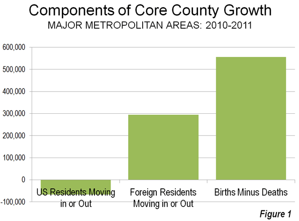
Figure 1 indicates the components of population change in the core counties of the nation's 51 metropolitan areas with more than 1,000,000 population (there are no city level migration data).
- There was a net gain in natural growth of 556,000 (births minus deaths)
- There was a net gain in international migration of 295,000 (people who moved from outside the nation to the core counties.
- There was a net loss in domestic migrants of 67,000. These US residents moved away from the core counties.
As we indicated in Still Moving to the Suburbs and Exurbs: The 2011 Census Estimates, there was net domestic migration to the suburbs and exurbs between 2010 and 2011. There was net domestic migration out of the central counties (there is no "city" migration data). This is illustrated in Figure 2, which has been annotated to make the actual moving of people clear.
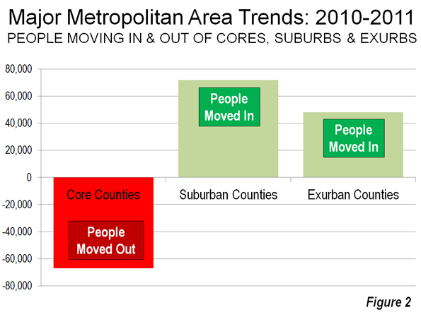
If it should ever occur, it will be very clear when people are moving to the cores from the suburbs and exurbs. There will be PLUS domestic migration numbers to the core counties and MINUS domestic migration numbers from the suburbs and exurbs. Until that time any flocking (though that is too strong a word for current trends) will be away from the cores and to the suburbs and exurbs.
Of course, in the greatest economic downturn in more than 75 years, domestic migration has slowed considerably. It is not surprising, therefore that population growth rates in the exurbs and suburbs have fallen, since far fewer people are moving.
All Domestic Migration was to the Suburbs: Finally, all of the net domestic migration in the nation was to the suburbs and exurbs of the nation's major metropolitan areas (Also see Figure 2).
On the Health of Exurban Housing Markets
On a related subject, University of South Florida Professor Steven Polzin offered an interesting comment on the Planetizen site:
While I have not explicitly researched the distribution of home foreclosures as a function of the transportation costs of residents, I would caution analysts to more fully explore the nature of the housing foreclosure trend before jumping to the assumption that transportation costs were a significant contributor to geographically differential rates of foreclosure. Foreclosures were more prominent in homes purchased more recently relative to the housing crash. These new home purchasers were more often highly leveraged, had little equity in their home, and in many cases younger workers with less job seniority and more susceptible to layoffs. In addition, in fringe areas that had been growing there was a high concentration of homes all purchased recently. Thus, new growth areas were more susceptible to both foreclosures and the cascading effect of home depreciation spreading based on nearby foreclosed properties.
In a new suburb a young financially extended family may lose their job, have no equity in the house and quickly lose their house. Its depreciated value is soon reflected in adjacent appraisals cascading the stress throughout relatively fragile neighborhoods. On the other hand in established neighborhoods only a relatively small share of the homes changed hands near the peak of the building bubble. Thus, many of those homeowners had far more equity in their home and perhaps more job seniority and security enabling them to whether a housing downturn. In addition, the diversity of home ages and types and the less frequent occurrence of foreclosed properties will control the pace at which home value depreciation will cascade through the neighborhood.
If commuting cost was as big a contributor to suburban fringe foreclosure rates then one would have expected downtown condominiums to weather the housing bubble. In many locations like Florida large clusters of new downtown residential properties suffered the same rapid depreciation as did suburban fringe areas. The concentration of new units seemed to be more critical than the location.
Similar sentiments have been posted on these pages from time to time, such as here and here.
We recently partnered with Catherine Mulbrandon at VisualizingEconomics.com to create a series of treemaps that illustrate important aspects of the labor market. In this post we provide a sneak peek at two of the graphics she created. The remainder will be posted in An Illustrated Guide to Income in the United States, a booklet from Catherine set to be released this summer.
These two graphics are based on EMSI’s labor market database, which is a combination of over 80 public and private data sources. More specifically, the first table shows job change for all occupations by industry (based on 2-digit supersectors, as defined by the North America Industry Classification System) and the second shows occupation change by education level. The data is from 2001-2011.
Red indicates decline and blue indicates growth.
Each square on the graphic indicates a specific 5-digit occupation classified by the Standard Occupational Classification system. There are over 800 unique squares present on the charts. Large squares, like the ones on the upper right and in the retail trade sector, indicate a lot of jobs for the specific occupation code. Smaller squares indicate occupations with less jobs.

In the graphic above we have pulled together occupation data related to all 20 NAICS supersectors. Government, health care, and retail trade have the largest employment. Utilities, mining, and management of companies have the fewest jobs. Also note the size of the squares within each industry sector. Here are a few observations:
- Broad momentum. It is interesting to note how each broad industry sector tended to either be dominated by growth or decline. For instance, with very few exceptions, almost every occupation within the manufacturing sector declined from 2001-2011. The same holds true for construction, information, agriculture, and, to a certain extent, retail trade. Conversely, sectors like health care, educational services, professional/scientific/technical services, accommodation and even arts tended to show occupational growth.
- Mixed sectors. Other industry sectors like finance, administrative, real estate, wholesale trade, and government were much more mixed.

The graphic above shows the distribution of jobs across all levels of educational attainment. We use the same 5-digit SOC codes and group them according to what their typical educational attainment is. Where possible, occupation titles are included so you can get a sense of where certain jobs fall. Here are a few quick observations:
- The OJT sectors (on-the-job training) are huge. This includes short-term OJT (lower right), moderate-term OJT (upper left), long-term OJT (middle right), and work experience in a related field (center). Also notice how the occupations in these sectors are less stable than the others. This is consistent with what was observed in the latest recession — jobs with higher education levels tend to perform better in tough economic times.
- Advanced degrees showed growth. Over the past 10 years, every occupation associated with a more advanced degree (master’s, doctoral, professional) showed some sort of growth.
- The other sectors have mixed results. Bachelor’s degrees showed more stability over the past 10 years, but there are a handful of occupations that declined since 2001. The same holds true for associate’s, postsecondary vocational awards, and degrees plus work experience.
Differing views on the future of California urban areas are the subject of a California Senate Republican Caucus report (Briefing Report: Attack On The Suburbs: SB 375 And Its Effects On The Housing Market).
The report details differing views on the future of California urban areas as described by University of Utah Professor Arthur C. Nelson in a report for the Urban Land Institute with those of newgeography.com authors Joel Kotkin and Wendell Cox in recent editions of The Wall Street Journal.
Nelson's view is largely that the market for detached housing in California is in decline. Senate Bill 375's planning mandates are being interpreted to virtually ban further construction of detached housing in the state's metropolitan areas.
However, if Nelson's analysis were right, there would be no need for legislative intervention since people would not buy detached housing. In fact, however, the demand for detached housing remains strong. Between 2000 and 2010, detached housing accounted for 80 percent of new housing additions in California's major metropolitan areas.
Critics of Senate Bill 375 market interventions that would seek to steer the market toward hyper density housing (20 to 40 and more housing units to the acre) would increase traffic congestion, increase the intensity of air pollution and make California and encumber an already laggard economy.
The report concludes: "Clearly, before the California Legislature decides to take over the community planning duties of local governments and engage in social experimentation with the housing market, it should perhaps look at both sides of the argument to see if the experiment will be successful."
It wasn't that long ago that the U.S. was cast as the global climate villain, refusing to sign the Kyoto accord while Europe implemented cap and trade.
But, as we note below in a new article for Yale360, a funny thing happened: U.S. emissions started going down in 2005 and are expected to decline further over the next decade, while Europe's cap and trade system has had no measurable impact on emissions. Even the supposedly green Germany is moving back to coal.
Why? The reason is obvious: the U.S. is benefitting from the 30-year, government-funded technological revolution that massively increased the supply of unconventional natural gas, making it cheap even when compared to coal.
The contrast between what is happening in Europe and what is happening in the U.S. challenges anyone who still thinks pricing carbon and emissions trading are more important to emissions reductions than direct and sustained public investment in technology innovation.
— Ted and Michael
Yale 360
Beyond Cap and Trade: A New Path to Clean Energy
Putting a price and a binding cap on carbon is not the panacea that many thought it to be. The real road to cutting U.S. emissions, two iconoclastic environmentalists argue, is for the government to help fund the development of cleaner alternatives that are better and cheaper than natural gas.
by Ted Nordhaus and Michael Shellenberger
A funny thing happened while environmentalists were trying and failing to cap carbon emissions in the U.S. Congress. U.S. carbon emissions started going down. The decline began in 2005 and accelerated after the financial crisis. The latest estimates from the U.S. Energy Information Administration now suggest that U.S. emissions will continue to decline for the next few years and remain flat for a decade or more after that.
The proximate cause of the decline in recent years has been the recession and slow economic recovery. But the reason that EIA is projecting a long-term decline over the next decade or more is the glut of cheap natural gas, mostly from unconventional sources like shale, that has profoundly changed America’s energy outlook over the next several decades.
Gas is no panacea. It still puts a lot of carbon into the atmosphere and has created a range of new pollution problems at the local level. Methane leakage resulting from the extraction and burning of natural gas threatens to undo much of the carbon benefit that gas holds over coal. And even were we to make a full transition from coal to gas, we would then need to transition from gas to renewables and nuclear in order to reduce U.S. emissions deeply enough to achieve the reductions that climate scientists believe will be necessary to avoid dangerous global warming.
But the shale gas revolution, and its rather significant impact on the U.S. carbon emissions outlook, offers a stark rebuke to what has been the dominant view among policy analysts and environmental advocates as to what it would take in order to begin to bend down the trajectory of U.S. emissions, namely a price on carbon and a binding cap on emissions. The existence of a better and cheaper substitute is today succeeding in reducing U.S. emissions where efforts to raise the cost of fossil fuels through carbon caps or pricing — and thereby drive the transition to renewable energy technologies — have failed.
In fact, the rapid displacement of coal with gas has required little in the way of regulations at all. Conventional air pollution regulations do represent a very low, implicit price on carbon. And a lot of good grassroots activism at the local and regional level has raised the political costs of keeping old coal plants in service and bringing new ones online.
But those efforts have become increasingly effective as gas has gotten cheaper. The existence of a better and cheaper substitute has made the transition away from coal much more viable economically, and it has put the wind at the back of political efforts to oppose new coal plants, close existing ones, and put in place stronger EPA air pollution regulations.
Yet if cheap gas is harnessing market forces to shutter old coal plants, the existence of cheap gas from unconventional places is by no means the product of those same forces, nor of laissez faire energy policies. Our current glut of gas and declining emissions are in no small part the result of 30 years of federal support for research, demonstration, and commercialization of non-conventional gas technologies without which there would be no shale gas revolution today.
Starting in the mid-seventies, the Ford and Carter administrations funded large-scale demonstration projects that proved that shale was a potentially massive source of gas. In the years that followed, the U.S. Department of Energy continued to fund research and demonstration of new fracking technologies and developed new three-dimensional mapping and horizontal drilling technologies that ultimately allowed firms to recover gas from shale at commercially viable cost and scale. And the federal non-conventional gas tax credit subsidized private firms to continue to experiment with new gas technologies at a time when few people even within the natural gas industry thought that firms would ever succeed in economically recovering gas from shale.
The gas revolution now unfolding — and its potential impact on the future trajectory of U.S. emissions — suggests that the long-standing emphasis on emissions reduction targets and timetables and on pricing have been misplaced. Even now, carbon pricing remains the sine qua non of climate policy among the academic and think-tank crowds, while much of the national environmental movement seems to view the current period as an interregnum between the failed effort to cap carbon emissions in the last Congressand the next opportunity to take up the cap-and-trade effort in some future Congress.
And yet, the European Emissions Trading Scheme (ETS), which has been in place for almost a decade now and has established carbon prices well above those that would have been established by the proposed U.S. system, has had no discernible impact on European emissions. The carbon intensity of the European economy has not declined at all since the imposition of the ETS. Meanwhile green paragon Germany has embarked upon a coal-building binge under the auspices of the ETS, one that has accelerated since the Germans shut down their nuclear power plants.
Even so, proponents of U.S. emissions limits maintain that legally binding carbon caps will provide certainty that emissions will go down in the future, whereas technology development and deployment — along with efforts to regulate conventional air pollutants — do not. Certainly, energy and emissions projections have proven notoriously unreliable in the past — it is entirely possible that future emissions could be well above, or well below, the EIA’s current projections. But the cap-and-trade proposal that failed in the last Congress, like the one that has been in place in Europe, would have provided no such certainty. It was so riddled with loopholes, offset provisions, and various other cost-containment mechanisms that emissions would have been able to rise at business-as-usual levels for decades.
Arguably, the actual outcome might have been much worse. The price of the environmental movement’s demand for its “legally binding” pound of flesh was a massive handout of free emissions allocations to the coal industry, which might have slowed the transition to gas that is currently underway.
Continuing to drive down U.S. emissions will ultimately require that we develop low- or no-carbon alternatives that are better and cheaper than gas. That won’t happen overnight. The development of cost-effective technologies to recover gas from shale took more than 30 years. But we’ve already made a huge down payment on the technologies we will need.
Over the last decade, we have spent upwards of $200 billion to develop and commercialize new renewable energy technologies. China has spent even more. And those investments are beginning to pay off. Wind is now almost as cheap as gas in some areas — in prime locations with good proximity to existing transmission. Solar is also close to achieving grid parity in prime locations as well. And a new generation of nuclear designs that promises to be safer, cheaper, and easier to scale may ultimately provide zero-carbon baseload power.
All of these technologies have a long way to go before they are able to displace coal or gas at significant scale. But the key to getting there won’t be more talk of caps and carbon prices. It will be to continue along the same path that brought us cheap unconventional gas — developing and deploying the technologies and infrastructure we need from the bottom up.
When all is said and done, a cap, or a carbon price, may get us the last few yards across the finish line. But a more oblique path, focused on developing better technologies and strengthening conventional air pollution regulations, may work just as well, or even better.
For one thing should now be clear: The key to decarbonizing our economy will be developing cheap alternatives that can cost-effectively replace fossil fuels. There simply is no substitute for making clean energy cheap.
© 2010 Yale Environment 360
If you’re looking for some good news in the U.S. economy, you might want to head to the warm, energy rich Gulf Coast. You wouldn’t be alone in making that move; over the past decade the “Third Coast”—extending from south Texas to the Gulf of Mexico—enjoyed 12% job growth, or about twice the national average.
This is remarkable given that the region was socked with several devastating hurricanes, including Katrina in 2005. New Orleans’ population, for instance, is still well below its pre-Katrina level, although now gaining steadily.
New Orleans also demonstrates the possibilities. Film production is way up, and the city appears to be emerging as a magnet for video game, commercials, and special effects firms.
Some of the biggest advances are further along the periphery from New Orleans, often somewhat closer to Baton Rouge. Nucor is constructing a massive new steel mill in Convent, located in St. James Parish about an hour away from New Orleans. Local chemical and oil refinery firms are also expanding and investing in new equipment.
Yet it’s Houston’s star that is shining brightest. Over the past decade, when the country actually slightly lost jobs, the Houston-Sugarland-Baytown region expanded its employment by over 15%. Since 1990, the number of jobs has risen by 46%, more than twice the national average. Over a period of ten years, the region’s population has soared 26%, the most of any of the country’s largest metro areas, and again better than twice the national norm. Migrants are coming not only from other countries, but from much of the rest of the U.S., particularly the industrial Midwest, Northeast, and California.
Optimism among businesspeople on the Third Coast is infectious, as can be seen in the expanding footprint of the Texas Medical Center, the world’s largest such facility. Much of the money for this amazing complex comes from a similar boom in oil and gas.
If there’s a negative tone anywhere, it’s about politics. Concerns over continued federal obstacles to responsible expansions in oil and gas production are widespread. There’s a real concern that this year’s elections will lead to a slowdown in orders and future expansion. Let’s hope not.
This piece first appeared at the National Chamber Foundation Blog.
When I moved to Los Angeles 30 years ago, Ocean Front Walk in Venice Beach looked like a hippie parody. It had a counter-cultural veneer, but didn’t rate as an authentic bohemian hot spot.
Contrast, for example, with New York’s East Village with its revolutionaries, junkies, artists and various iconoclasts living side-by-side.
The weekend spectacle at Venice – vendors, performers and “street people” showing off to crowds of tourists – struck me as self-conscious and phony. Plus, I could never call Ocean Front Walk a “board walk” because (unlike Brighton Beach and Coney Island) there was No Board.
Since then, of course, New York has been “cleaned up.” Now Tompkins Square is family-friendly and the old walk-ups are inhabited by urban professionals worried about layoffs and declining property values.
Times have changed. The gulf between haves and have-nots is widening. Living on the edge is not just a life-style choice. “Drop-outs” need somewhere to go.
These days I see Ocean Front Walk in Venice as more a refuge than a counter-cultural carnival. With overnighters climbing out of their sleeping bags each morning, it’s a pretty good location for people without money.
Where else should they live?
I understand why local residents are advocating that something be done to make Ocean Front Walk safer and more sanitary. With some calling for a police “crack down.”
But now that the “tune-in, turn-on, drop-out” sub-culture is a history text book sidebar, I’m glad there is, at least, someplace warm for the dispossessed to hang out.
Here at Venice Beach, where the continental U.S. ends, could be the last stop for these new bohemians.
Editor Sommer Mathis over at The Atlantic Cities has taken to making stuff up. In a recent post she reported on a dispute in the city of Seattle over minimum parking requirements relating to multi-unit buildings. She said:
Defenders of suburban-style development like Wendell Cox and Joel Kotkin would argue that these young people just don't understand how their lives and desires are going to change once they start families. Single-family, detached homes with a quarter acre of land and two cars in the garage are suddenly going to look a lot better to all these idealistic, bicycle riding twenty-somethings once the reality of parenthood sets in.
Kotkin and Cox also worry that developers and city planners rushing to meet the youth-driven demand for denser housing options that don't necessarily include parking are shooting themselves in the foot.
The only problem is that I have never commented on minimum parking requirements. I checked with Joel Kotkin and he advises that he has never covered the issue.
Mathis continues (after an citing a quote by Joel Kotkin article in Forbes):
What's funny about these assumptions is their total lack of faith in the free market.
Of course, since our alleged positions on minimum parking requirements are figments of Mathis' imagination, her "free market" conclusion misses the mark. Indeed, the most destructive impact on urban land markets today is urban growth boundaries and "winner picking" land use restrictions that deny people their preferences (as my Wall Street Journal piece, California's War on Suburbia, argued on Saturday). I am most concerned about these because of their potential for hampering the metropolitan economy, interfering with upward mobility and increasing poverty (I suspect Joel would agree). Moreover, young households soon figure out that they need more than the 4th floor (or 40th floor) balcony to raise a child.
We are used to dealing with jurisdictional boundaries when assessing and comparing cities. These are often either municipal areas or metropolitan statistical areas (which are based on entire counties). But these can have little relevance to the amount of area in a given city-region that is actually urban in nature. This makes apples to apples across regions difficult.
Once a decade though the Census Bureau gives us a more detailed look. They release definitions of so-called “urbanized areas” that attempt to look at just the amount of land that is actually urban in form. In theory this would allow for better apples to apples comparisons between regions. Unfortunately, most data is not sliced this way, so we only get this glimpse. Here’s the map of the new 2010 urbanized area definitions:

Wendell Cox has a breakdown of the largest urbanized areas that includes density. He also published a historical review that tracks urbanized area population and density since 1950 for the largest city regions. For more thoughts on urbanized areas, see Nate Berg’s take over at Atlantic Cities.
I don’t want to try to offer a complete analysis of this right now, but one thing that really jumped out at me was the very low densities of some southern boomtowns like Atlanta (1,707/sq. mi) and Charlotte (1,685/sq. mi.). Contrast with even Houston (2,979/sq. mi.) and Dallas (2,879/sq. mi) and see the difference. Atlanta is already showing serious signs of weakness vs. the Texas mega-metros and I wonder if this is part of the reason why. It also makes me wonder if Charlotte might someday suffer in a similar manner if its growth ever flames out.
Like most Americans, I was bombarded by sound-bites and blog-bytes surrounding an amendment to an Act of Congress that would require a woman to submit to and review the results of a trans-vaginal ultrasound before receiving an abortion. This amendment was covered ad nauseam by everyone from the Huffington Post to the nightly news on broadcast television. I don’t mind admitting that I’m past the age where this Act of Congress would have an effect on me personally.
What really bothered me was that no one talked about the core problem of how deranged our political process has become in Washington. The real issue here that impacts all of us is that this amendment was attached to a transportation funding bill – TRANSPORTATION, not a Health Care Bill or a Health Insurance Bill or even an Equal Opportunity Employment Bill but a TRANSPORTATION funding bill.
All of these journalists are as at fault over the issue as the bunch of Congressmen who tried – once again – to slip one past the balance of powers and our democratic form of government. The guilty parties in Washington DC start with:
In the House of Representatives, Mr. Fortenberry (NE), Mr. Boren (OK), Mrs. McMorris Rodgers (WA), Mr.Scalise (LA), Mr. Tiberi (OH), Mr. CONAWAY (TX), Mr. Lamborn (CO), Mr. Walberg (MI), and Mr. Lipinski (IL) who introduced “H.R.1179 -- Respect for Rights of Conscience Act of 2011” on March 17, 2011. By the time the bill was attached as an amendment to the highway funding bill, the number of co-sponsors had risen from 8 to 221.
In the Senate, Mr. Blunt (MO), Mr. Rubio (FL), and Ms. Ayotte (NH)) introduced S. 1467 on August 2, 2011. The cosponsors in the Senate went from 2 to 37.
That’s a total of 260 elected representatives who will be responsible for the continuing deterioration of highway infrastructure in the United States. The current Federal authorization for funding surface transportation programs ends March 30, 2012.
The current funding authorization is just the most recent in a long line of temporary extensions that have been strung together since the last 5-year plan expired in 2009. The highway funding bill in question – to which this healthcare amendment is being attached – would authorize funding of $109 billion over 2 years. If nothing is done by March 30, if no action is taken to fund US highway infrastructure, the Department of Transportation (DoT) will have to furlough workers and stop paying contractors, according to Humberto Sanches of Roll Call. Last summer, DoT sent home 4,000 FAA employees and 70,000 private-sector workers because Congress failed to act on funding.
The process for highway funding is already convoluted and inefficient – watching the current Congress add abortion amendments to the funding bill gives us a peek into how it got that way. In the meantime the United States’ infrastructure is crumbling and the rest of the world is getting ahead of us. No wonder we’re deranged.
|


