NewGeography.com blogs
Iowa Governor Terry Branstad has refused to pay $15,000 in annual dues to the Midwest High-Speed Rail Association. This comes after the state legislature declined to fund intercity rail programs in the 2012 budget. Various public agencies had offered to pay the $15,000 on behalf of the state, however Branstad declined the money, with a spokesperson saying that the Legislature had "made their will crystal-clear" about funding membership in the organization.
The Midwest High-Speed Rail Association has been promoting an intercity rail system that would serve Chicago from other major metropolitan areas, operating at substantially below international high-speed rail standards. In the case of the Iowa route, travel to Chicago would be slower than the present bus service, which does not require public subsidy and which provides free high-speed Internet. This issue is described in greater detail in an earlier article.
The proposed national high-speed rail system has run into considerable difficulty at the state level. In addition to the reluctance of Iowa to participate, the states of Florida, Wisconsin and Ohio have refused federal funding. In the case of Florida, the genuine high-speed rail system was canceled by Governor Scott out of fear that the cost overruns, which have occurred in 90 percent of cases, would be the responsibility of state taxpayers. The California system could be nearly $60 billion short of its funding requirements for the first phase and is running into serious difficulties from citizens along the route. The Missouri legislature declined to include funding for part of the Midwest system earlier this year. Finally, the North Carolina legislature has placed requirements for its own review of any future federal grants for high-speed rail.
"Despite years of effort by city leaders to revitalize San Antonio’s downtown neighborhoods, thousands of residents flocked to sprawling subdivisions on the far North and West sides in the past decade, while the inner city lost residents."
That is how John Tedesco, Elaine Ayala and Brian Chasnoff of the San Antonio Express-News described the continuing dispersion of the San Antonio metropolitan area's core Bexar County in an analysis of census tract population trends between 2000 and 2010 (we had reported more generally on the continuing dispersion of San Antonio a few months ago).
Referring to the "siren song of the outlying suburbs," the authors note that the strongest growth in Bexar County occurred in suburban areas outside the outer beltway (the "Anderson Loop" or state route 1604). The growth, largely on the north and west sides of the county was nearly one-half of total county growth. At the same time, the inner city lost population.
The Express-News analysis indicates that the population increased 233 percent in the northern and western areas outside the Anderson Loop. Inside the inner loop (Interstate 410), the population increased 7 percent. This includes the inner city area, where the population declined three percent. In the rest of the county (between the inner and outer loops and the outer suburbs of the east and south), the population increase was 24 percent.
Outside core Bexar County, the metropolitan area added 34 percent to its population, more than any of the three major sectors of Bexar County.
The reporters noted that "Every San Antonio mayor who served in the past decade preached the virtues of life in the inner city. For many people, it’s an appealing message — in theory. “Most people agree,” former Mayor Phil Hardberger said. “And then they drive out beyond 1604 to their houses.”
Norman Dugas, a residential subdivision developer and past president of the Real Estate Council of San Antonio told the Express-News “The reality is, market forces are much more important than any planning emphasis or desire to shape development.” Put another way, "preaching" is not enough. People will likely follow their preferences unless forbidden to do so, which is regrettably a policy direction in some places.
Subsidies to the core areas (often plentiful) and exhortations by public officials (few, if any of whom have themselves moved permanently to the inner city from the suburbs) are unlikely to change how people prefer to live.
Now that Texas Gov. Rick Perry is officially in the running for the Republican presidential nomination, journalists and econ bloggers from almost every national news outlet have examined the Texas’ economy in excruciating detail. The fact that Texas has produced nearly 40% of all new jobs in the US since 2009 has been regurgitated over and over again, and the state’s remarkable population spike has repeatedly been cited as a reason for the big employment growth.

But more than those shared story lines, writers have offered another strikingly similar theme in their Texas critiques: many have pointed to the wave of oil and gas jobs as the key driver of the state’s economic boom.
To be sure, energy employment is part of Texas’ growth, as EMSI highlighted in June. But it’s far from the biggest part. CNNMoney did a nice job laying out the super-sectors that have done well in the Lone Star State, and we’re going to drill down even further using EMSI’s detailed data to see which specific industries are fueling the state’s growth.
How Texas Stacks Up
It’s true that Texas has accounted for a large share of new jobs in the US, and that’s not just the case since 2009. Going back to 2001, Texas has added more than 2.1 million jobs, according to EMSI’s latest complete dataset, while the rest of the nation has combined for 6.2 million new jobs.
But Texas is a massive state, of course, with a population of more than 24 million. So to even the playing field, let’s look at percentage job growth.
As it turns out, there are only four states that have grown from 2001 to 2011 and from 2009 to 2011.

Like Texas, Wyoming and Utah have also had 18% growth since 2001, but no state has performed better since 2009 than North Dakota. Its employment base has grown 5% in the last two years, compared to 2% for Texas. But because North Dakota has a much smaller population — and workforce — than Texas, its growth typically doesn’t get mentioned in discussions like these.
Energy is a Big Player — But Not the Biggest One
Oil and gas extraction employment in Texas has more than doubled in the last 10 years, and support industries for drilling have also boomed. Altogether, the mining, quarrying, and oil and gas extraction sector has jumped from over 230,000 jobs in 2001 to just under 490,000 in 2011.
But that’s only a fraction of the 14.2 million jobs in the state, and the oil and gas growth accounts for slightly more than 10% of all new jobs in the state since 2001.
What have been the biggest job gainers? Health care and social assistance (421,000-plus) and government (nearly 282,000) have made the largest additions to their payrolls in the last decade. It should be noted, however, that government jobs have declined in the last year — and were growing stagnant before then.
Yet once you extract federal government jobs, it’s clear that state and local government employment is doing considerably better in Texas than other states. Texas is one of 10 states that have seen increases in state and local government jobs since 2009, and its growth (29,287) is nearly nine times that of the state with the second-most growth, Kentucky (3,327).
These numbers don’t exactly bolster Perry’s small-government agenda claims.
State and Local Government Job Change (2009-11)

In terms of detailed sub-sectors, temporary health services, crude petroleum/natural gas extraction, and home health services have been the strongest performers in Texas since 2009. Overall, 19 industries have added at least 5,000 jobs since ’09, of which electric power distribution has had by far the largest percent growth (111%).
| NAICS Code |
Description |
2009 Jobs |
2011 Jobs |
Change |
% Change |
| 561320 |
Temporary Help Services |
171,096 |
204,456 |
33,360 |
19% |
| 211111 |
Crude Petroleum and Natural Gas Extraction |
290,638 |
317,388 |
26,750 |
9% |
| 621610 |
Home Health Care Services |
240,018 |
263,099 |
23,081 |
10% |
| 930000 |
Local government |
1,240,713 |
1,261,970 |
21,257 |
2% |
| 213112 |
Support Activities for Oil and Gas Operations |
89,179 |
108,765 |
19,586 |
22% |
| 221122 |
Electric Power Distribution |
11,840 |
25,038 |
13,198 |
111% |
| 722110 |
Full-Service Restaurants |
371,893 |
385,081 |
13,188 |
4% |
| 814110 |
Private Households |
113,106 |
125,148 |
12,042 |
11% |
| 621111 |
Offices of Physicians (except Mental Health Specialists) |
198,795 |
210,077 |
11,282 |
6% |
| 622110 |
General Medical and Surgical Hospitals |
265,013 |
274,810 |
9,797 |
4% |
| 920000 |
State government |
354,190 |
362,219 |
8,029 |
2% |
| 551114 |
Corporate, Subsidiary, and Regional Managing Offices |
90,157 |
98,159 |
8,002 |
9% |
| 213111 |
Drilling Oil and Gas Wells |
34,826 |
42,562 |
7,736 |
22% |
| 425120 |
Wholesale Trade Agents and Brokers |
58,575 |
64,461 |
5,886 |
10% |
| 452112 |
Discount Department Stores |
63,272 |
69,137 |
5,865 |
9% |
| 561720 |
Janitorial Services |
152,316 |
157,919 |
5,603 |
4% |
| 623110 |
Nursing Care Facilities |
99,246 |
104,651 |
5,405 |
5% |
| 561110 |
Office Administrative Services |
88,376 |
93,599 |
5,223 |
6% |
| 522110 |
Commercial Banking |
112,482 |
117,698 |
5,216 |
5% |
Key Regional Industries
We also looked at the most concentrated industries in Texas, as compared to national employment concentration, to see which industries are unique to the state and tend to be export-oriented. Oil and gas extraction — and the production of equipment for extraction — figure prominently among this group of industries.
Crude petroleum/natural gas extraction is more than 4.5 times more concentrated in Texas than the nation, and it accounts for more than 300,000 jobs. Other industries with high LQs and large employment bases: support activities for oil and gas operations; engineering services; and office administrative services.

For more on Texas’ economy, be sure to read Tyler Cowen’s post at Marginal Revolution. And for more on Texas’ growth, check out this piece on the top cities in the US.
Illustration by Mark Beauchamp
A few weeks ago EMSI looked at the states with the largest share of 1099 workers — that is, proprietors/independent contractors, farm workers, and others not covered by unemployment insurance. We found that since 2006 every state (as well as D.C.) has seen growth in noncovered workers.
Simply put, the number of workers outside traditional employment rolls is on the rise.
We have since mapped out job growth among 1099 workers in every U.S. county from 2006-2011 to see where this increase in nontraditional employment is most evident. And the data makes the trend even clearer: The majority of counties across the nation have seen at least a small increase in noncovered workers, and some have seen huge increases. This is especially the case in the western and southwestern portions of the U.S.
It should be emphasized that not all 1099 workers captured in the EMSI Complete dataset are proprietors/independent contractors. However, if we use growth in the 1099 economy as a loose proxy for entrepreneurial behavior (i.e., a backbone for economic growth and business development), it’s very apparent which areas are progressing in that arena and which areas are falling behind.

The counties with the most 1099 job growth are mostly in fairly isolated areas:
1, Loving County, Texas, 114% (the least populous county in the US)
2, Todd County, South Dakota, 81%
3, Calhoun County, West Virginia, 63%
4 (tie), Roane County, West Virginia, 57%
4 (tie), Reagan County, Texas, 57%
4 (tie), Union County, Florida, 57%
7 (tie), Wayne County, Utah, 54%
7 (tie), Shackleford County, Texas, 54%
9, Ochiltree County, Texas, 53%
10, Kenedy County, Texas, 52%
Seven of the top 12 counties, in fact, are in Texas, including Midland County. Oil and gas extraction, the fastest-rising sector for 1099 workers in the US, is driving most of this growth in workers outside the unemployment insurance (UI) system.
In contrast, the counties showing the biggest job loss in 1099 employment have a more diverse population base:
1, Ziebach County, South Dakota, -23%
2 (tie), St. Louis City, Missouri, -15%
2 (tie), Roanoke County, Virginia, -15%
4, Ohio County, West Virginia, -14%
5, Sully County, West Virginia, -13%
6, Oliver County, North Dakota, -12%
7 (tie), Marshall County, South Dakota, -11%
7 (tie), Forsyth County, Georgia, -11%
9, Pennington County, South Dakota, -10%
10, Decatur County, Iowa, -9%
Railway Age reports that Premier Wen of China "has told the state media that the government will suspend approvals of new rail while it conducts safety checks to address concerns rising from the high speed train collision last month that killed 40 people."
The Premier also indicated that high speed rail trains should operate at slower speeds "at their earlier stage of operation." Earlier this year, the Ministry of Railways slowed all trains to a maximum speed of 300 kilometers per hour (186 miles per hour) and many trains that were to operate at that speed were slowed to 250 kilometers per hour (155 miles per hour). At the time, reports indicated that the slower speeds were to lower operating costs so that fares could be reduced. Concerns had been raised about the much higher fares on the new trains and the cancellation of many conventional trains, which had much lower fares. Railway Minister In addition, Sheng Guangzu told the press that the slower operating speeds would "offer more safety."
Photo: Suzhou to Nanjing at 300 kph (by author)

Alert reader Jessie sent me this article about Houston ranking "very low" on a "resilience capacity index". For real. I was dumbfounded too. And now I'm going to post out-of-character and get a little snippy...
Let's skip right past the parade of articles and data showing Houston and Texas weathering the great recession better than just about everywhere else in the country. It's so strong Rick Perry might win the Republican presidential nomination based on it. That alone should make them question their entire methodology. Go back to the dot-com and Enron crashes, and you'll find the same minimal impact. Sounds like we're pretty resilient to me.
Then there's their explicit declaration that it represents the ability of a city to weather the shock of a major storm or flood. I'll point to both Tropical Storm Allison and Hurricane Ike. Both were devastating - yet we bounced back relatively quickly from each one. You might note on their map that New Orleans ranks higher than Houston, yet Hurricane Katrina knocked New Orleans on its back for years. Maybe they need to add a "levees upkeep" variable to the index?
Let's look at some of the problematic variables that make up the index:
- Economic diversification: I'll admit there's some value here, but it's also worth noting that some of the wealthiest and most successful cities in the country built that success around one strong, dominant industry: NYC and finance, DC and govt, SF/SV and tech, Houston and energy, etc.
- Income equality: also a proxy for "we don't have any high-paying industries" - nor the corresponding tax base. How is this helpful for resilience? (more on the value of income disparity here)
- Educational attainment, being out of poverty, and home ownership: a proxy for using tight zoning and land-use regulation to keep out apartments, new and affordable housing, and immigrants.
- Metropolitan Stability: aka "stagnation". Cities that aren't growing have amazingly stable populations because nobody wants to move there and none of the residents can sell their houses.
My cynical side thinks that, since the University of Buffalo put this out, they intentionally chose variables that made Buffalo look good, even though it's one of the most stagnant metro economies in the country.
All in all one of the worst designed indexes I've ever seen - and there are some doozies out there.
OK, I feel better. End venting (and snippyness).
Read more from Tory at HoustonStrategies.com.
A crazy owner and inept management are destroying a critically important Southern California institution. And I’m not talking about the Dodgers.
Recent layoffs of veteran writers at the L.A. Times are not just symptoms of a declining newspaper business. The once-powerful daily has been run into the ground by Tribune Company’s Sam Zell, who acquired the property from the Chandlers.
The below-standard L.A. Times online version lets civic-minded residents keep track of regional affairs, while showcasing a few top-notch local journalists. But with the firing of 39-year reporter / editor / columnist Tim Rutten and other seasoned writers, the Times has plunged deeper into the abyss.
When I got to town 30 years ago, the L.A. Times influence was extraordinary. As a PR guy, I learned that getting coverage in that paper set up the whole news cycle. I watched as the Times singlehandedly tore down powerful local figures (remember former L.A. Coroner Thomas Noguchi)?
Now L.A. Times investigations barely matter (did anyone read the recent five-part “expose´” on the Community College District construction program)?
There’s talk about Tribune trying to unload the Times-Mirror Square building and of operational mergers with the Orange County Register.
But it looks as if this century-old powerhouse – which began as a virulent anti-union, jingoistic rag and was transformed into a nationally-recognized metropolitan daily – is now suffering its worst indignity:
Irrelevance.
This piece first appeared at LaborLou.com.
As the Los Angeles County Metropolitan Transportation Authority (Metro) prepared for its most recent round of major bus operations reductions, Metro CEO Art Leahy has been quoted:
"(T)oo many bus lines with excessive service has led to regular budget deficits1."
"How full are Metro buses today? Overall, Metro buses are running at an average of 42 percent capacity. Of course, that doesn’t mean that all Metro buses are less than half full. Another measure to gauge bus usage is called ‘load ratio’ — the ratio of passengers to bus seats at the most crowded part of a bus route. By that count Metro’s average load factor is an average of 1.2. (For example, 48 passengers on a 40 seat bus). Many other large transit agencies are running load factors of 1.5 to 1.72 ."
The "42 percent" capacity is evidently the average passenger load (APL) divided by the number of seats – in other words, on average for the full year, each 40-seat MTA bus had about 17 passengers on board.
Forty-two percent might appear to be a low value, particularly in comparison to other modes of transportation like scheduled airlines, where it is common to have a 100% load factor on some flights. However, Lufthansa doesn't stop at Wilshire/Vermont to pick up passengers between LAX and JFK – transit service is scheduled for peak load factor; that is, attempting to approach, but not exceed, a maximum load factor at the point on the line where the number of people on board is largest.
In the second quote, we have a mixture of load factors terms and data. Almost all transit operators have load factor standards, which they set for each mode of service (bus, light rail), time of day, day of week, and type of service (main line arterial bus service, long-haul commuter, neighborhood circulator). For Metro, the peak load factor criterion had been 1.20 – the 48 passengers on a 40-seat bus – since this was imposed by the Consent Decree that settled Labor/Community Strategy Center v MTA in late 1996 until very recently.
In that quote, Metro is comparing services standards to actual performance. It is certainly true that, until the passage of the new policy a few months ago, Metro's 1.20 service standard was one of the lowest in the industry for larger city operators. However, Metro routinely failed to meet this standard, which was a major source of complaints by the plaintiffs in L/CSC v MTA – and MTA's overall average passenger loads have among the highest in the industry for decades.
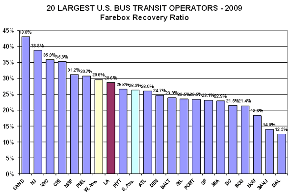
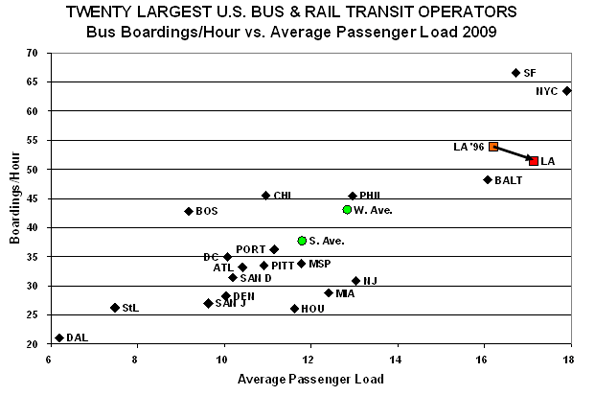
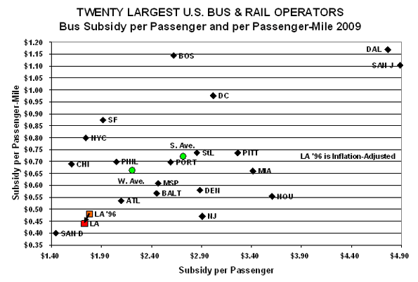
Comparing actual results to actual results is far more meaningful than comparing service standards to service standards. Is 42 percent low, high, or what? The standard methodology for determining this is peer group comparison. The Federal Government makes transit data available though its National Transit Database – which we used for the 2009 reporting year3.
We then constructed our peer group, the twenty largest U.S. transit operators by annual unlinked passenger trips that operate both bus and rail service4 and developed the data for:
APL: Average Passenger Load
BHr: Boardings/Hour
FRR: Farebox Recovery Ratio
SP: Subsidy/Passenger
SPM: Subsidy/Passenger Mile
The results are:
1. FRR: Higher is better - but, this statistic can often be misunderstood. For example, a high cost operator with high fare can have a higher FRR than a low cost operator, but the low cost operator will be providing a better deal, financially, for both the riders and the taxpayers.
2. APL/BHr: Appearing and to the right on the next graph indicates higher load factors. Higher is better; however, at some point, overcrowding impacts service quality and reliability.
3. SP/SPM: On this graph, lower is better, so down and the left is superior - except that, at some point, low cost can indicate concerns about quality of service and safety.
While Metro is not among the highest in FRR, it has more than twice as many ranked below it (13) than above it (six). Considered with the subsidy metrics, Metro bus service is a fair deal to the riders and a great deal for the taxpayers.
On the service utilization graph, Metro is second highest in APL, beaten by NYC, and third on BHr, beaten by NYC and SF. We added, "LA '96," for 1996, the year before the Consent Decree went into effect part-way through Metro's 1997 fiscal year. BHr has decreased slightly (53.9 to 51.4, or ~4.6%), while APL has increased slightly (16.2 to 17.1, or ~5.6%). The increase in APL is interesting because Metro's on-going replacement of primarily 43-seat "hi-floor" with 40-seat "low-floor" buses means that Metro is carrying more people in smaller buses.
Metro bus service again does well on cost-effectiveness. San Diego beats Metro on both SP and SPM and Chicago beats Metro on SP. Metro reduced both of these from 1996 to 2009 after adjusting for inflation5.
Finally, we decided to do a combined performance index, based on Metro's own "Route Performance Index" (RPI), which Metro utilizes to eliminate low performers6:
We have adapted METRO's RPI in three ways:
1. We use it for bus system performance, rather than route performance.
2. The "standard" is Metro's performance on each individual indicator. The overall score is set at 1.00 for Metro, broken into four components, each of which Metro scores .25. Operators scoring better on an indicator receives a score higher than .25; performing poorer, lower than .25, with the specific score a direct ratio against Metro's score (remember that, for subsidy, lower is better, while for route utilization, higher is better).
3. Metro utilizes three metrics in its RPI, SP, BHr, and APL. We added SPM.
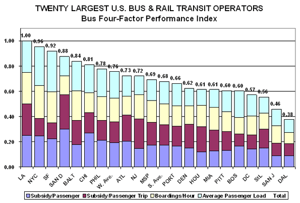
What we see is Metro rated the highest overall among its peers. Metro does not win on any single criterion, but its two seconds and two thirds put it ahead of the rest overall.
Metro's Transit Service Policy (page 32) states:
"Lines with an RPI lower than 0.6 are defined as performing poorly and targeted for corrective action. Lines that been subjected to correction actions and do not meet the 0.60 productivity index after six additional months of operations may be cancelled …"
If this .60 cut-off is applied to the 20 bus systems, several would be in major trouble. Dallas (.38), San Jose (.46), Saint Louis (.56), and Washington, DC, (.57) are below the cut-off. Boston and Pittsburgh (both at .60) are right on the line, and Miami (.61), Houston (.61), and Denver (.62) only slightly above.
If one takes the Metro RPI and applies it to the nation's Top 20, nine of the 20 are either below or very close to the cut-off point. This implies that a high portion of the individual lines, a majority in at several cases, are below the Metro route-by-route cutoff point.
Circling back to Metro routes, this could mean that many of the routes that Metro would cut, using its RFI procedure, would be average or even above-average routes for many of the nation's larger bus systems. Failing to meet the Metro average is actually a very high cut-off point when compared to the national performance.
This is not to say that no Metro service should ever be cut or eliminated. What we are saying is, don't make the cut-off point too high; there is a lot of well-utilized service, by national standards, that does not pass Metro's methodology. More important, where there are bus lines with service reduced, put that back on the many, many Metro bus lines that are underserved – which is the usual condition.
From the above, we see Metro working very hard to cut to reduce the service operated by the most cost-effective and productive major city bus system in the nation – why? Unlike most other U.S. transit operators, it is not due to lack of funding – but the explanation will have to wait for my next blog entry.
The Pew Center on the States has released a new report examining the impact a potential federal default would have on state and municipal governments. The picture isn't pretty.
According to Pew, "A federal default could have a serious impact on states and cities by constricting their borrowing and budgets while they are still feeling the aftershocks of the Great Recession." Loss of faith in federal debt securities could have a knock-on effect on government debt at all levels, causing jittery ratings agencies to downgrade state and local credit ratings in turn. One ratings agency, Moody's, has already warned that up to 7000 municipalities could see their bond ratings lowered in the wake of a federal default, and has placed five currently AAA rated states on a downgrade watch list. Ratings downgrades would lead to increased borrowing costs for state and local governments, restricting their long-term ability to finance desperately needed infrastructure upgrades.
In addition to raising borrowing costs, a federal default could also directly impact federal program dollars currently allocated to state and local governments. According to Pew, such transfers amounted to "$478 billion in 2010 alone." States and municipalities, already stressed by years of budget challenges, might suddenly find themselves even more cash strapped. In addition, the report points out that the suspension of federal payments to individuals, such as social security recipients and government contractors, could cause a drop in state and local tax receipts as individual incomes drop and commerce slows. While Pew feels states and local governments are "highly unlikely" to face a shutdown as a result of a federal default, they could be left scrambling to find alternative funding sources to cover already budgeted expenses they were expecting to meet with federal support.
The Martin Prosperity Institute recently released the map below, which compares the GDP of several US metropolitan areas to the size of national economies. For instance, the Boston-Cambridge-Quincy metropolitan statistical area (MSA) has a GDP of $311.3 billion dollars. If it were a country, it would be the 40th biggest national economy on earth, ahead of countries such as Denmark ($310.1) and Greece ($303.4). The Houston-Sugar Land-Baytown MSA has a GDP of $378.9 billion, which would make it the 31st biggest national economy, bigger than Austria ($375.5) and Argentina ($368.9). New York-Long Island-Northern New Jersey ($1.28 trillion) isn’t all that far behind Canada ($1.57 trillion).

While trotting out such comparisons is an interesting exercise, the comparison also gives us some important perspective. Despite the fact that these cities, as well as many others, produce as much as large countries, they have nowhere near the same fiscal levers at their disposal. Further, they are subservient to higher levels of government. The same problem exists in Canada. The Greater Toronto Area’s economic output ($233.9) is nearly equivalent to Finland’s total GDP ($270.6). Note that this definition is far less expansive than the US metro areas listed above. If the definition were expanded to include the entire Golden Horseshoe, it would be closer to the Size of Norway ($414.3 billion). Yet the City of Toronto can’t finance a public transit expansion without the two senior levels of government. Calgary ($62.5 billion), roughly the size of Lithuania, couldn’t decide to create a municipal sales tax. Vancouver ($85.5 billion), slightly bigger than Serbia, can’t even decide how to allocate gas tax dollars without a special deal with the federal government.
The problem isn’t that we have too little government spending, but that revenue collection and spending decisions often happen at the wrong level. Revenue generation and spending should take place as close as possible to the point of delivery. There is no reason why someone in Moose Jaw should pay federal income taxes so that the Federal Government could partner with the province of New Brunswick to build a highway near Moncton. Similarly, there’s no reason why someone in Edmonton should send property tax dollars to the province so that it can pay for a transit expansion in Calgary. Not only is filtering money through multiple layers of bureaucracy inefficient, but it leads to bad decision making. Decisions both on the revenue, and expenditure side need to be made at the lowest level of government possible.
In order to ensure that cities can meet their infrastructure requirements, provincial governments should gradually devolve spending responsibilities and revenue generating capacities to the municipalities, and the federal government should end the practice of intervening in infrastructure issues altogether. Some municipalities may choose to raise property taxes, others may increase user fees, and still others may experiment with municipal sales taxes. But regardless of how municipalities decide to raise revenue, they are better placed to determine how much revenue is required, and which projects are really essential. More importantly, devolution gives more direct control over decision making to the people that are actually impacted by the decisions. Devolution means more accountability, and more local input. And if tiny Iceland can fund it’s own infrastructure, there’s no reason why Winnipeg or Edmonton couldn’t do the same.
This piece originally appeared at the Frontier Centre for Public Policy Blog.
Steve Lafleur is a public policy analyst with the Frontier Center for Public Policy.
|