NewGeography.com blogs
Here’s a simple question for you…which metro areas did prospered the most during the past business cycle? (2000-2008) Were the winners the highly-educated communities that make up the Creative Economy? Or did someone else zoom ahead?
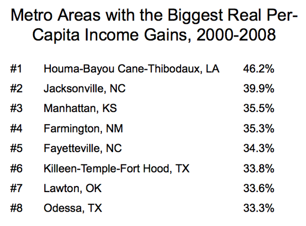
I asked myself these questions when I was preparing for a talk that I was giving at the Rochester Institute of Technology on innovation and economic development. Being a man of numbers, I calculated the gains in real-per capita income for all metro areas. Who do you think was #1, and who do you think was #366 (out of 366)?

A bit surprising, isn’t it? The common themes are guns and oil. The big gains in the #1-ranked Houma region are mainly connected with the increase in oil drilling, since BLS data shows that wages in the mining/oil industry in Terrebonne Parish, where Houma is located, soared from $58K a year to $78K from 2005 to 2008. #2 Jacksonville (NC) is the location of Camp Lejeune. Fayetteville (NC). #5 Fayettville (NC) is home to Fort Bragg, one of the larget military bases in the world. #6 Killeen is obviously home to Fort Hood. #8 Odessa, Texas, is riding the oil boom.
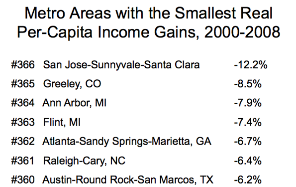
Now let’s look at the metro areas which were the biggest losers in real per-capita income, 2000-2008.

Uh, oh. This is not the list you might have expected, in a world where brains and innovation are supposed to be important. There’s Silicon Valley at the top (or the bottom) of the list, where incomes didn’t recover from the popping of the tech bubble that peaked in 2000. But other tech-type metro areas, such as Raleigh and Austin were hit hard as well.
Brains and education did not seem to count too much in success in the last business cycle. Overall, the top ten cities, measured by growth in per capita income, had an average college graduate rate of 17.7% The bottom ten cities had a college graduate rate of 31.8%.
Is this inverse relationship between growth and education going to persist into the future? Impossible to say. My personal view is that the lack of rewards for education–which show up in the individual income statistics as well–is correlated to the lack of commercially-successful breakthrough innovations, which would immediate sop up all the excess college graduates.
To put it another way, innovative industries tend to locate where they can get a lot of college graduates. That means high education areas attract new companies, boosting growth.
But without innovation, the whole economic development dynamic changes. You can’t attract growing innovative companies because they are few and far between. For their part, companies are more likely to view cost as a main consideration in deciding where to locate. Goodbye San Jose and Austin, hello China and India.
Mike Mandel is Editor-in-Chief of Visible Economy. This post originally appeared on his blog "Mandel on Innovation and Growth."
According to the Bureau of Labor Statistics, there were 290,000 more jobs in the US this month than there were last month. Twenty percent of those jobs were added by the federal government. While the federal government added 69,000 new jobs last month, every other level of government – including the post office – cut an average of 2,250 jobs. State governments were hardest hit last month, cutting 5,000 jobs.
Since April 2009, the federal government has added 119,000 jobs while state and local governments cut 215,000 jobs.
Compared to April 2009, more than 500,000 jobs have been added in employment services. Another 329,000 jobs were added in the healthcare industry. These must be the “green shoots” that we were so looking forward to last summer because the overall economy lost 1,380,000 jobs in the last year.
Eighty percent of the jobs increase last month was added in the private sector. Of the jobs created in the private sector, only 22 percent were in goods producing industries; about half of the goods producing jobs added in the last month can be attributed to the bailout of the auto industry. In the last 12 months, the U.S. civilian population increased by 2.1 million persons. The labor force has remained about constant at 154.7 million. The difference – explained in the details of today’s jobs report – is attributable to discouraged workers, involuntary part-time workers, and marginally attached workers.
An article by Carl Bialik in The Wall Street Journal questions the value of city livability ratings, such as lists produced by The Economist and Mercer. This issue has been raised on this site by Owen McShane.
(1) The Wall Street Journal notes a lack of transparency in ratings. In the case of The Economist and Mercer, this starts with the very definition of "city." They don't say. In the case of New York, for example, is the city Manhattan?, the city of New York or the New York metropolitan area. The difference? Manhattan has fewer than 2,000,000 residents, the city about 8,000,000 and the metropolitan area about 20,000,000. That makes a difference. The same problem exists, to differing degrees in the other "cities," whatever they are.
(2) The first principle of livability is affordability. If you cannot afford to live in a city it cannot, by definition, be affordable.
The Economist ranks Vancouver, Melbourne, Sydney, Perth, Adelaide and Auckland among its top 10 livable cities. In fact, in our 6th Annual International Housing Affordability Survey, these metropolitan areas rank among the 25 least affordable out of 272 metropolitan areas in six nations (the United States, the United Kingdom, Canada, Australia, Ireland and New Zealand). The Economist's champion, Vancouver, is most unaffordable, with Sydney second most unaffordable. Mercer's top 10 list also includes Vancouver, Auckland and Sydney.
By contrast, the three fastest growing metropolitan areas with more than 5,000,000 population in the developed world, (Atlanta, Dallas-Fort Worth and Houston) have housing that is one-half to one-third as expensive relative to incomes (using the Median Multiple: the median house price divided by the median household income) as all of the "cities" noted above in the two lists.
Purpose of the Lists: The purpose of these lists, for all their difficulties, is often missed. The Economist and Mercer do not rate livability for average people, but rather for international executives. Thus, the lists are best understood as rating cities for people with a lot of money and a big expense account. The lists may be useful if one is contemplating a move from Manhattan's Upper East Side to London's Mayfair.
Unfortunately, The Economist and Mercer lists are often treated by the press as if they rate the quality of life for average citizens, which they most surely do not.
The average Vancouverite does not live on English Bay, nor does the average Sydneysider have a view of the Harbour Bridge. Because of escalating house prices, they are far more likely to live in rental units, with the hope of home ownership having made impossibly expensive by rationing, through restrictive land use policies, of an intensity that not even OPEC would dare adopt.
The California State Auditor's report title says it all: High-Speed Rail Authority: It Risks Delays or an Incomplete System Because of Inadequate Planning, Weak Oversight, and Lax Contract Management.
The report, which can fairly be characterized as "damning," criticizes the California High Speed Rail Authority on a wide range of issues, some of which go to the very heart of the project itself.
For example, the State Auditor says that without additional bond funding from the taxpayers, the state "may have to settle for a plan covering less than a complete corridor." Given the financial and administrative disarray of the California High Speed Rail Authority, this is a distinct possibility, which was raised by the Reason Foundation California High Speed Rail Due Diligence Report, released in September of 2008 (co-authored by Joseph Vranich and me).
This could produce a system that spectacularly fails to meet the promises of its promoters, while enriching the income statements mostly offshore firms that build trains and of firms that failed so spectacularly in managing the Big Dig in Boston. Martin Engel, who leads an organization of concerned citizens on the San Francisco peninsula frequently notes that the real driving force behind high speed rail is spending the money. In this regard, the California High Speed Rail Authority will deliver the goods. The vendors and consultants will get their money.
The State Auditor also raises questions about the potential to attract the substantial private investment necessary to completing the project. This is a legitimate concern, since the California High Speed Rail Authority has raised the possibility of government revenue guarantees for private investors. This could lead to "back door" taxpayer payment of the "private" investment.
The Authority continues to skirt legal requirements. The State Auditor notes that the "peer review" committee, ordered by state law in 2008, is still not fully constituted. This is not surprising for an agency that delayed its publication of a legally mandated business plan from two months before the 2008 bond election to days after it.
In its response, the California High Speed Rail Authority was relegated to taking issue with the report's title, characterizing it as "inflammatory" and "overly aggressive." It hardly seems inflammatory and overly aggressive to point out that an ill-conceived plan is rushing headlong to failure. The State Auditor rightly dismissed the criticism saying: "We disagree. The title accurately characterizes the risks the Authority faces, given our findings."
This potential financial debacle could not have come at a worse time for California. California's fiscal crisis is of Greek proportions. Economist Bill Watkins has raised the possibility of a default on debt. Former Mayor Richard Riordan has suggested bankruptcy for Los Angeles, the nation's second largest municipality.
Unlike many in California, Riverside's Press-Enterprise in high-speed rail in the context of California's bleak financial situation: The dearth of answers to basic fiscal questions suggests that taxpayers might end up paying for big financial deficiencies in the rail plans. Deficit-ridden California has better uses for public money; no list of state priorities includes dumping countless billions into faster trains.
Few would want to be in Los Angeles Mayor Antonio Villaraigosa's shoes. The Mayor, a tireless ally of public employee unions through his career is in the uncomfortable position of being forced to choose between his allies and the taxpayers. To his credit, as hard as it is, the Mayor seems inclined to favor the interests of the citizens who the city was established to serve in preference to the interests of those who are employed to serve the people. But the circumstances place the Mayor of having to approach the city's unions with an inappropriateness that lays bare fundamental flaws in the public sector collective bargaining arrangements that have emerged over the past one-half century. Noting that the unions have a choice between layoffs and cutting pay, the Mayor told The Wall Street Journal I was a union leader now. Rather than lay off workers and cut services, I'd agree to a pay cut.
The Mayor has been relegated to asking the city's unions to make decisions that should only be made by the city itself. The Mayor has asked the unions to accept pay cuts, so that impending public service cuts can be minimized. In effect, the unions are being asked to make a fundamental policy choice that should be the city's alone to make. The city of Los Angeles, the Mayor and the city council, are the legal policymaking body for the city of Los Angeles. There is no state statute or provision of the city charter that grants policy making authority to others.
Yet, under the public sector labor bargaining system that has emerged, the city may have no choice, unless it is willing to file Section 9 bankruptcy to void the union contracts and impose a solution that favors the interests of the citizenry. A predecessor, former Mayor Richard Riordan has called for such a filing. Short of that, perhaps the city should require some sort of a "sovereignty" clause in the next round of negotiation that permits labor contract provisions to be altered during emergency situations, so that public service levels can be preserved.
Whatever the solution, the union public policy authority is an ill-gotten gain. This is not to suggest that the unions are wrong for having exercised the power; that is only natural. However, they should never have been able to gain such a position.
It is fundamentally wrong for the city of Los Angeles and countless other municipal jurisdictions around the nation, to have abdicated its policy authority over recent decades. There is a need for a new public employment paradigm in which the incentives of governance favor the interests of the households that make up the cities, towns and counties.
What started as a humble video segment for Reason TV has mushroomed into a lot of positive PR for Houston (and less than positive for Cleveland). It started with famous actor and comedian Drew Carey working with the libertarian Reason Foundation on a video series about saving Cleveland, his hometown. Houston is held up as a "best practice" example for land use regulation. There are lots of suggestions and positive comparisons to Houston on red tape (minutes 29:20 thru 32), zoning (37:30), and opportunity (47:50). Yours truly has a short cameo at 38:55. (If you want to be able to jump around, the trick is to start playing it, then hit Pause. You'll see the grey loading indicator continue to download the video. Come back later after it's fully loaded and you'll be able to jump to any point you like.)
After the series was released to the internet and Forbes declared Cleveland the Most Miserable City in America, John Stossel at FOX Business News picked it up. A friend of mine loaned me a DVD of the 45 minute show (thanks Nolte), but I haven't been able to find it online. There are shorter segments about it here and here. The first one jumps right into talking about Houston 16 seconds in, and the second one jumps into Houston around 40 seconds and 58 seconds in. The Cleveland newspaper writes about the show here.
Unfortunately, one of the professors he has on the show to present the other side brings up another one of those Houston myths that just won't die: that you can build anything next to anything, including a strip club next to a day care center or school. No, we have narrow nuisance and SOB regulations to prevent that. We also have private deed restrictions. You don't have to prescriptively control everything to prevent the worst-case scenarios.
Then Bill O'Reilly picks up the story in an interview with Stossel (hat tip to Jessie):
STOSSEL: People go to where the weather is good. We already have...
O'REILLY: Well, you can't blame the city for the weather. I mean, look at Chicago. Great city, bad weather. Boston, come on. You can't blame the city for the weather.
STOSSEL: You can rank them for that. And you can blame the politicians for saying we're going to raise taxes to build our wonderful projects, and that's going to make things better. The cities that prosper like Houston are the cities that have fewer rules and lower taxes.
O'REILLY: But remember Houston used to be the crime capital? They cleaned that place up pretty well.
STOSSEL: But Cleveland has 22 zoning categories. Houston has none.
O'REILLY: Twenty-two zoning categories? Very hard.
STOSSEL: In Cleveland, to start a business, a politician bragged, "We could get you in there in just 18 months." In Houston, one day.
O'REILLY: One day? The problem with no zoning is you can have, you know, the No-Tell Motel right next to you. And...
STOSSEL: You could. But that rarely happens. And it's not an ugly city, Houston.
O'REILLY: No, I didn't say it was ugly. Who said it was ugly?
STOSSEL: Lots of people. No zoning. The city planner said it will be ugly. You will have...
O'REILLY: We have a lot of Houstonians watching "The Factor," and I love going to Houston. All right. There you are, the Forbes magazine list, and Stossel laying it down.
We've come a long way. Five or ten years ago, you couldn't find many people - including libertarians - that were willing to hold Houston up as a land-use model in public because our reputation was so bad. But now they do, and it's (slowly) changing our national reputation for the better.
This post originally appeared at HoustonStrategies.com
If someone is just finding out last week that Wall Street is profiting from the crisis it created, then I have only one question for them – "what rock have you been living under for the last two years?"
I’ve been shining a bright light on this since I first joined NewGeography.com to cover finance. From one of my first articles in November 2008, where I explained the nuances of financial innovations – “Who stands to gain? … Citigroup, Goldman Sachs, JP Morgan and Morgan Stanley …. You can do the math from there.” – to recent blogs on the impact of stimulus and bailout spending – “Goldman Sachs … even got transaction fees for managing the Treasury programs that funded the bailouts.” – I hope that it has been more obvious than painful that you have to take personal responsibility for your finances because you can’t rely on Wall Street to do it for you.
Last week, the SEC charged Goldman Sachs with civil fraud. On Friday, a group of investors filed a lawsuit against Goldman’s executives for behaving in an “unlawful” manner and for “breaches of fiduciary duties” – meaning they were reckless with other people’s money. Goldman is also being sued by the Public Employee’s Retirement System of Mississippi for lying about the real value of $2.6 billion in mortgage-backed securities (MBS). I remind you that there’s a good chance that Goldman (and other Wall Street banks) were and are selling MBS that don’t have mortgages behind them – as I like to put it, there’s no “M” in their “BS”.
In a nauseating twist to the story, AIG (according to sources for the Business Week article) insures Goldman’s board again investor lawsuits – so AIG may be paying the costs of defending Goldman’s executives in addition to any fines or settlements on the cases. AIG is still on bailout life support from US taxpayers. In December 2009, the Federal Reserve Bank of New York took $25 billion worth of AIG preferred stock as partial payback for the $182.3 billion bailout.
Even less shocking to readers of NewGeography.com should be the story that the SEC lawyers were busy surfing the internet for pornography when they should have been preventing this stuff from happening in the first place. I wrote an article last February about bailed-out Wall Street bankers spending taxpayer money on prostitutes. Those SEC staffers will need to be up to date on all things unholy when they head for the door that leads them to more lucrative jobs on Wall Street.
Like the arsonist who gets the insurance payoff after burning down his own house, the Wall Street bankers profited from transaction fees in creating the crisis, profited from the bailout payoffs funded by the U.S. taxpayers and they continue to profit from their credit derivatives as the whatever was left standing begins to collapse around us. Like most Americans, I think I’d get some sense of satisfaction from seeing someone in handcuffs over what has been done to the value of our savings and the global reputation of our capitalist system.
With President Obama’s approval ratings headed downward, there’s a growing interest in the powerful Cook County politicians that pushed Obama. James Peterson has written a three part series on Chicago Machine boss, Alderman Ed Burke. The series was written for Andrew Breitbart’s Big Government website.
The first installment of the series deals with Alderman Burke’s association with the Chicago Mob. Burke’s unapologetic relationship with Alderman Fred Roti, who was described by the FBI (in 1999) as one of only 47 made members of the Chicago Mob. Peterson quotes this resolution Burke entered into Chicago’s City Council glorifying Roti:
Fred B. Roti, a committed public servant, a cherished friend of many and good neighbor to all, will be greatly missed and fondly remembered by his many family members, friends and associates.
Peterson’s second article deals with top FBI informer Robert Cooley’s accusation that Alderman Burke attempted to fix a murder trial for the Chicago Mob. Even though Cooley repeated this accusation, Burke failed to sue him or the publisher of the book. Peterson also deals with the sensitive subject of Alderman Burke’s relationship with Chicago’s media. Peterson quotes a 2003 Chicago Sun-Times story:
The curious public feud between City Council’s most powerful alderman and one of Chicago’s highest profile television reporters was turned up a notch Wednesday. Unable to persuade WLS-TV Channel 7 to pull reporter Andy Shaw off the City Hall beat because of the bed and breakfast Shaw and his wife run out of their Lincoln Park home, Finance Committee Chairman, Edward M. Burke (14th) did what he considers to be the next best thing. He introduced a legislative “order” directing six city departments—Fire, Revenue, Buildings, Streets and Sanitation, Zoning and Public Health—to enforce “any and all provisions” of the municipal code at only one address:607 West Deming. That happens to be the address of the Windy City Urban Inn, where the Shaws have continued to rent seven rooms at their three-story mansion…
Part three deals with Alderman Burke and the legitimate world. Peterson delves into the relationship Burke has had with the law firm Jenner and Block. Peterson quotes an a 1997 Chicago Sun-Times story:
Ald. Edward M. Burke (14th), whose decisions on hiring lawyers in the City Council ward remap case have funneled $7.5 million in city fees to the prominent Jenner and Block law firm, holds co-counsel status with that firm in two recent lawsuits, court records show. Burke’s links with the firm do not appear to violate any laws or regulations…
Managing partner Jerold Solovy – who is the lead attorney in the remap case – was treasurer of the unopposed 1996 campaign for Illinois Appellate Court justice of Anne Burke, the alderman’s wife. And prominent [Jenner and Block] partner John Simon served as her campaign chairman. The firm provided $14,414.15 in services and money to the campaign.
The firm hired Burke’s daughter Jennifer A. Burke in June, 1995, shortly after she graduated 173rd in a class of 385 from Chicago Kent College of Law. In making new hires, the firm usually draws top students from the nation’s leading law schools. Two weeks ago, Burke, whose name has been linked to the federal investigation of ghost payrolling at City Hall, hired Jenner and Block partner and former U.S. Attorney Anton Valukas to represent him in that inquiry.
Anyone interested in the place President Obama came from should read all three articles in detail. Alderman Burke is one key people who fast tracked Obama’s career. You’ll also want to read about the Chicago Democrats and the Chicago Mob. When Rod Blagojevich’s trial starts on June 3, the names of Tony Rezko, Jesse Jackson Jr., Valerie Jarret, Rahm Emanuel, and David Axelrod, and Barack Obama are guaranteed to be mentioned. They are part of the Chicago Democratic Machine, a Machine with Alderman Burke at the top.
For the past six years, Hugh Pavletich of Performance Urban Planning (Christchurch, New Zealand) and I have authored the Demographia International Housing Affordability Survey. The Survey assesses structural housing affordability by the use of the Median Multiple (median house price divided by the median household income). This measure is in wide use and has been recommended by the United Nations and the World Bank.
Six nations are routinely covered, including the United States, the United Kingdom, Canada, Australia, Ireland and New Zealand. In each of these nations, the Median Multiple has been astonishingly similar, at least until recent years, with all six nations having had a Median Multiple of 3.0 or less until the last decade, or at the worst, the late 1980s. Of course, as Demographia and a world-class collection of economists have shown, house prices have risen substantially relative to incomes as a result of growth management (also called smart growth, urban consolidation) that ration land for development.
For the first four years of the Survey, California markets were the most unaffordable, with Los Angeles exceeding 11 at one point, while San Francisco, Honolulu and San Diego exceeded 10. That all changed with the US housing bust, which was the most severe in California. As a result, Vancouver has become the most unaffordable major metropolitan area in the six nations, with a Median Multiple of 9.3 in the 2010 Survey. Sydney was a close second at 9.3.
The South China Morning Post, Hong Kong's leading English language newspaper, approached Demographia to estimate a Median Multiple for Hong Kong. This we were pleased to comply, given our interest in expanding the scope of the Survey to more than the six nations.
It took a considerable amount of "digging" to develop the data, and a number of emails back and forth with The South China Morning Post. The result was an estimated Median Multiple for Hong Kong (the entire Special Economic Region) of 10.4. This makes Hong Kong the least affordable metropolitan area of the 273 Demographia has reported upon. The South China Morning Post illustrated this in an attractive graphic.
At least temporarily, however, home purchasers in Hong Kong have been able to arrange financing packages that mute these high costs. Currently, mortgage interest rates are from 0.8% to 2.1%, which is far below the lowest levels reached in the six nations. As a result, such homeowners find their housing more affordable that some metropolitan areas with higher Median Multiples (such as Vancouver and Sydney).
However, things could soon change. Professor Chau Kwong-wing of the University of Hong Kong calls the present situation: "... just a short-term illusion," adding that "People think they can afford an expensive flat with a reasonably cheap mortgage. Their dreams will burst and the flat will become unaffordable when the interest rate rises." The professor has a point. Variations in interest rates can mask or magnify structural affordability, which is measured by the Median Multiple. This is because interest rates are subject to fluctuation, while buyers and sellers do not renegotiate sales prices after the deal is concluded.
Professor Chau echoed the land regulation views of the economists, indicating that the need for "increasing land supply for sales."
We look forward to routinely reporting on Hong Kong in future editions of the Demographia International Housing Affordability Survey.
Hong Kong has grown fast in recent decades, not only in population but also in income. International Monetary Fund placed Hong Kong's 2009 gross domestic product per capita (adjusted for purchasing power) only 10% below that of the United States, and 15% above its former colonial administrator, the United Kingdom. Hong Kong was even further ahead of other major European Union nations and Japan.
Forbes Magazine just released its "Best Places for Business and Careers" list and it's no surprise to me that Des Moines, Iowa just landed in the top spot. Nearly 5 years ago, I'd have said the same thing you may have just muttered. "Des Moines...that's fly over country...who'd want to live and work THERE?" I fully appreciate your logic with our cold winters, humid summers, and ag-centric heritage. But weather and corn fields aside, the Des Moines metro, a circle consisting of about half a million people, has captured my heart and I've become its most passionate evangelist.
After a lifetime of Southern California bustle, my wife wasn't exactly thrilled about my desire to abandon our friends and family infrastructure. But ultimately she wanted me to have more than a view from the windshield of a Honda Civic and to be a stay-at-home mom for our kids. We began to see clearly that reaching goals for entrepreneurship, more family time, and more civic engagement were unattainable in our current location. We were ready to reclaim our time, live with less hassle, and stretch a bit.
So in 2005, we executed geographic arbitrage landing in Clive, Iowa, a beautiful community on the West side of the Des Moines metro. Soon the memory of my 2.5 hour daily plunge into freeway hell was fading. Views of the beaches and mountains from the window of the 6:20AM flight to DFW became real life experiences on urban bike trails and fishing at the lake blocks from my house. A 20-minute drive from end-to-end, the Des Moines metro area defines easy living and 70 miles equals 60 minutes. (I'm still chronically early to my appointments.)
During those first months here a local business blogger who'd been reading my copious posts on "Why Des Moines?" reached out to me. After coffee and a few introductions, my personal and business network began to flourish. It was hard to comprehend how quickly anyone who's willing could reach top level contacts in business, associations, and in government. Before long I was shopping a business plan to investors and prominent business owners in town. I was even introduced to State House representatives who cared about my thoughts on what's happening in their districts. (I went 33 years never meeting a Congressman in CA.) I realized that within a few phone calls I could reach top decision makers, corporate leaders, and legislators and they were willing to listen to me. My business createWOWmedia is growing rapidly now and I'm reaping the benefits of 2.5 years of head down execution and statewide relationship building. I had the time, the energy, and the start up capital through my CA home sale to stop dreaming and start doing. The Des Moines metro gave me that opportunity and I'm thankful for it.
I've figured out that if you're willing to endure a couple months spent largely indoors or bundled up that the trade-offs are magical and worth their weight in gold. I wouldn't trade what I've found here for anything. The Des Moines metro and the state of Iowa as a whole offer so much…and ask so little in return. Des Moines is easy living defined.
Am I worried about a massive influx of new Iowans pouring in from Western states based on this piece and Forbes's recommendations? No chance. But if you do decide to take the plunge and reclaim your life from the concrete jungle, shoot me an email and I'd be happy to guide you. That's what good neighbors and Iowans do.
Doug Mitchell is a Southern California refugee who moved his family to Des Moines, Iowa to build a better life. Doug can be reached at doug@createWOWmedia.com or on twitter @doug_mitchell
|
